It wasn’t that long ago that blogs were merely online diaries where people shared details of their personal lives. But over time, they transformed from simple avenues that allow you to pour your heart out to tools that help shape brand identities, making blogging a vital business element.
But, as you probably know, blogging is no easy feat. You not only have to think about content optimization but also your blog design since it can determine reader attraction and retention rate.
How do you create a visually appealing and functional blog page? Read on as we assess a list of blogs that have mastered the art of delivering both aesthetics and functionality.
How to spot a great blog layout and design
You can tell a lot about a blog’s quality simply by looking at it. Here are some common features among blogs with thoughtful designs:
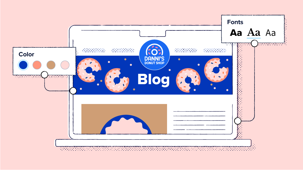
- Simple color schemes, uniform logos, and readable fonts
- Minimalistic layouts focusing the reader’s attention on page content
- Responsiveness across various devices
- Strategic empty space
- High-quality images, animations, or infographics to complement and break up text
- Easy navigation, menus, and search functions
- Calls to action to help guide audiences
- Elements like alt text for images and text contrast for readability and accessibility
- Footers with relevant contact details and navigation or social media links
- Article thumbnails for seamless accessibility.
10 picks for beautiful blog design and layout inspiration
Looking for some great inspiration for your next blog design? Read on for some of the best blog design examples on the internet today:
(Note: These examples were found during our online research for this article.)
1. TED Blog
If you’re familiar with TED Talks, odds are you need no introduction to the TED Blog. Like its “Talks” counterpart, the TED Blog focuses on inspiring change and spreading knowledge on various topics, from technology and entertainment to design and personal development.
It’s one of the most successful blogs because of its investment in a functional and visually appealing design. The blog’s navigation is seamless, so you don’t need prior experience with the page to get the content you need. It also has a remarkable loading speed and responsiveness, allowing you to access whatever you need seamlessly from your mobile device.
In terms of aesthetics, the blog has implemented a minimalistic approach, using a neutral color scheme with shades of red, black, and white. It also has well-thought-out imagery to complement the blog’s content and features a structured layout, with article thumbnails and a search feature for easy reader accessibility.
Another notable feature is the blog’s social media integration. You can seamlessly follow the TED Blog on Instagram, X (formerly Twitter), and YouTube or even subscribe to its newsletter with the click of a button.
Why it works: The blog design is effective because it isn’t over the top. Its minimalistic nature and incorporation of vital elements, like the search button, make it aesthetically pleasing and user-friendly, qualities to aim for in web design.
2. Wired
Wired is a diverse blog focusing on a wide range of contemporary topics, from business and culture to politics, security, and science. It’s one of the most popular blogs because of its balance between functionality and aesthetic appeal.
Functionality-wise, the blog’s navigation, mobile responsiveness, and loading speed are nothing short of extraordinary. You can quickly browse through different blog categories on your mobile phone to find what you’re looking for.
Aesthetically speaking, Wired has a minimalist design, focusing mainly on a black-and-white color scheme and only using high-quality images to supplement its topics. Its layout is also remarkable, as it contains thumbnails and accompanying images, allowing readers to scan different articles quickly.
Why it works: Wired’s blog design works because the focus is on the reader’s experience. Its layout promotes accessibility, as you can move through different categories seamlessly. Additionally, its visual elements are just enough to capture readers’ attention without distracting them from the topics.
3. Notion
Notion is a technology-focused blog that immerses you in everything from artificial intelligence (AI) to workplace productivity. Now, you’d expect a tech-focused blog to be all stuffy-looking because of the seriousness of its content, but this couldn’t be further from the case with Notion.
The blog design is a perfect blend of functionality with a spice of visual appeal. Readers can seamlessly navigate through the captivating blog thanks to its responsiveness, loading speed, and, best of all, user-friendly interface. Further, visitors can easily access the most recent articles by tapping the “Latest” section.
As you can probably guess, this blog has also embraced a minimalist aesthetic, focusing on neutral colors and basic fonts for optimal readability. It also features various high-quality videos and animations to complement topics.
Additionally, it carries Facebook, Instagram, YouTube, LinkedIn, and X links, allowing readers to connect on social media.
Why it works: Simplicity over complexity is why it’s on our list. If inspired by the simple and functional design, you can use Notion’s blog templates to make your design easier.
4. Scary Mommy
No, Scary Mommy isn’t literally about scary mommies. It covers virtually everything to do with motherhood, from pregnancy to how to handle life with teenagers, and topics beyond parenting.
It’s among the top on our list because of its consistency in content and overall design. The blog features a uniform color palette, making it easy for readers to recognize it without even seeing its logo. There’s also consistency in its imagery—every piece is accompanied by an image of parents, kids, and pets.
But there’s more to the blog than aesthetics. To boost functionality, it contains an easy-to-use menu that directs you to the different categories covered in the blog. It’s also highly engaging—if you don’t have a specific category in mind, you can spin the wheel on the site to let the blog choose one for you.
Why it works: Simply put, consistency—color can boost brand recognizability by 87%! Just imagine how much maintaining a uniform theme across all design elements can help.
5. Webflow
If you’re looking for anything website-related, be it site building or SEO optimization, Webflow is a top contender. As a web-related blog, it’s no wonder this is a top option for inspiring blog designs.
The blog has a user-friendly interface and is well-structured, featuring “New,” “Popular,” “Ebooks and Webinars,” and “All” blog categories—categorizing articles into different sections facilitates seamless browsing.
Beyond functionality, the blog has invested in its visual appeal, combining various colors that stand out just enough to get readers’ attention without distracting them from core topics. It also features several different fonts, carefully positioned to bring just the right amount of intrigue to the web page.
Why it works: The Webflow Blog design features typography, colors, and a structure that captures your attention subtly.
6. Brit + Co
Talk about diversity! Brit + Co is everything individuals who enjoy a little variety in their reading are looking for. You can find everything from food and family content to the latest celebrity tea and entertainment recommendations, keeping you hooked for hours.
But the blog isn’t successful just because of its great content. Its design is just the right combination of functionality and aesthetic appeal. Brit + Co has a minimalist layout, with articles categorized into different sections to facilitate seamless browsing. Whether you want to keep up with Dua Lipa and Callum Turner’s relationship or get the latest sleep remedies, you only need to click the relevant category on the navigation bar—alternatively, you can use its search bar to find what you need.
The blog also features article thumbnails and high-quality images to capture readers’ attention and let them know what to expect before opening any post. And, for readers who enjoy engaging with bloggers on social media platforms, it provides links that take you directly to its social platforms.
Why it works: People prefer visuals to plain text—content with images and videos receives up to 94% more clicks than plain text. So, part of Brit + Co’s success results from its incorporation of engaging visuals.
7. Slack Blog
Don’t let the name fool you—the Slack Blog is anything but lazy. It provides a wide range of information on leveraging technology to boost productivity and promote seamless operations.
Getting the info you need is easy, as you simply need to tap your desired category on the navigation bar to get a bunch of topic recommendations. Further, the blog features vivid imagery and a diverse palette of colors—red, yellow, green, blue, and purple—most of which are already in the brand’s logo. This creates an eye-catching and cohesive image, drawing in readers.
Why it works: You can never go wrong with consistency. The blog is easily recognizable because it maintains a consistent color scheme in its logo, background, and imagery. Further, thanks to the webpage’s simple navigation, you don’t have to spend hours searching for information.
8. IndieWire
Do you enjoy sitting back with a bowl of popcorn and immersing yourself in the film world? If so, IndieWire is the right blog for you—whether you’re looking for movie recommendations, spoilers, or a deep dive into your favorite actors’ interviews, you’re in the right place.
So, why is it a blog design inspiration? Well, navigating the site is easy because it categorizes its pieces into sections like “Awards,” “News,” “TV,” and “Film.” It also provides related posts for each article so readers can dive seamlessly into their topics of interest.
Further, the blog has a consistent color scheme—black, blue, and white—and incorporates images to complement the written content. This makes it easy for readers to focus on vital blog elements and follow the stories. As a news and entertainment site, the blog goes further to add social media buttons, facilitating engagement with its audience.
Why it works: Readers are always looking for seamless navigation. IndieWire enables it through design elements like navigation bars. Further, it makes following stories easy through subtle yet effective imagery and color schemes.
9. Epicurious
Whether you’re a food connoisseur or simply an enthusiast learning to cook, Epicurious is the blog for you. It dives into everything food-related, from simple everyday recipes to special-occasion food recommendations.
But we love it for more than just the yummy delicacies it helps create. This food blog has an easy-to-use menu and a navigation bar that categorizes recipes by dietary preferences, allowing readers to find information quickly.
Additionally, it features numerous tempting photos guaranteed to entice you into opening more than a few articles. It also contains a lot of white space, which makes it look elegant and enhances readers’ experiences.
Why it works: Blog visitors typically want to enjoy enticing articles without feeling overwhelmed. Epicurious allows readers to do this by using plenty of white space on the blog homepage.
10. Anywhere We Roam
Curious about what to do on your next vacation through Europe, Asia, Africa, or the Americas? Anywhere We Roam can help.
The blog’s navigation bar lets you find your dream destination’s travel guide in seconds. If this doesn’t do it for you, the site’s beautiful blog design surely will. It features immersive imagery, making you feel like you’re traveling with the bloggers from the comfort of your home. For an even more immersive experience, you can engage with the bloggers beyond the site by tapping the social media buttons at the top of the page.
Why it works: High-quality visuals and seamless navigation are some of the most important blog design elements. Anywhere We Roam’s design prioritizes these qualities, making it one of the most successful blogs.
What should you focus on when designing a blog?
To maximize traffic on your site, you’ll need to implement effective content marketing tips and invest in your blog’s design. Your design determines how visitors interact with your page, drastically impacting engagement, visitor experience, and traffic and bounce rates. For a consistent readership, balance usability and visual appeal by focusing on the following elements:
- Simplicity: A complex blog layout will do more harm than good, as it can affect readability and navigation. Choose a clean, minimalistic layout to enhance reader experiences.
- Hierarchy: Visual elements like headings and subheadings can enhance reading experiences by providing structure.
- Typography: Clear and legible fonts can enhance a blog’s success by promoting readability.
- Color theory: While it may be tempting to go overboard with colors, simple schemes are more effective in communicating what you want because they’re less distracting. Use your brand’s colors for cohesiveness, or choose from one of the four main types of color relationships, depending on your desired effect (more on this later).
- Responsiveness: A blog design that adapts to different devices can promote reader retention and increase your site’s traffic.
Our top tips for creating the best blog design
Ready to transform your blog into a user-centric tool that attracts and retains readers? Get your gear ready and follow these tips to elevate your blog design:
Master the color palette
If you’re trying to color your headers or create colorful thumbnails for your blog, a color wheel can help you find the best colors. As mentioned earlier, color schemes fall into four main categories—monochromatic, complementary, analogous, and triadic. Here’s how you use the color wheel to find the right combination:
- Monochromatic: This is a color scheme with different variations of the same color, such as blue and dark blue. This palette may be suitable if you don’t want your blog to have a lot of contrast.
- Complementary: You can find this scheme’s combinations by picking any color on the wheel and then drawing a line across it to find its opposite color. This is a suitable option if you want a high-contrast effect.
- Analogous: For this palette, pick any color and then use the two colors on either side of it. These combinations are great for highlighting your key color. So, for example, you can use yellow-orange and yellow-green to highlight the color yellow.
- Triadic: To use this color scheme, draw a triangle within the color wheel and choose the colors that align with its vertices, for example, blue, yellow, and red. Triad colors can help you find a scale of colors to make up a theme for your blog.
Utilize white space
Did you know it takes less than two-tenths of a second for a visitor to form an impression of your website? If you don’t make the right impression, they won’t explore your blog.
Avoid including too many thumbnails or design elements in your blog, as this can make you appear disorganized, affecting readers’ perception. Instead, leave an empty (white) space to create a professional appearance and allow readers to grasp each page’s components comprehensively.
Use consistency and branding
There’s something great about not reinventing the wheel. If there’s a standard format you use in your blog or a set of branded colors you use for marketing, keep using them.
Some consistency throughout your branding will help readers become familiar with your business and promote overall cohesiveness. This can facilitate instant recognizability and build a sense of trust.
Take advantage of helpful tools
Who said blog design has to be a laborious task? Certainly not us!
You can leverage content creation tools to develop captivating visuals for your blog and enthrall your readers. Our top choices include:
- Bitly URL Shortener: It lets you create short, custom links branded with your domain for a professional touch—plus gives you insights into how readers interact with your links.
- Canva: It has preset templates for us to plug and play, whether we’re making social media cards, a presentation, or an infographic. As an added bonus, Canva integrates with Bitly to help brands elevate their QR Code designs!
- PicMonkey: It has a great free photo editor tool that allows you to crop, filter, and add various effects to your photos.
- Pexels and Unsplash: These are both free stock photography sites. They are a huge resource for us when we’re looking for shots to incorporate into our blog.
Optimize and test your design
Even with these tips, finding the right elements for your site may take some trial and error. Be patient and use A/B testing to determine the best blog design.
A/B testing involves changing different elements of your blog and assessing how it impacts the visitor experience and bounce rates. For example, you can change your color scheme, add white space, change your blog layout, or choose a different typography and ask independent parties, like customers, what they think about the new design. To measure your bounce rate, add it as a metric in your landing page report on Google Analytics.
Looking beyond aesthetics for a meaningful blog design
Focus on functional elements like ease of navigation and responsiveness as much as you do on your color scheme and visuals when designing a blog, as they all determine visitors’ experiences. If you’re unsure where to start, review the examples of blogs discussed here for some inspiration and experiment with different elements until you find the right fit.
Bitly’s link shortener can support your quest for the best blog design by simplifying blog URLs. This can be particularly helpful when refining your design, as you can seamlessly share short URLs and collect opinions on what you can do to improve user experiences.
Join the Bitly community today to take advantage of Bitly’s link shortener and maintain professional-looking blog URLs.