Whether you’re a small business owner or part of a dynamic team, chances are you’ve been tasked with designing assets for social media posts, your website, or even your email newsletter. Maybe you’re also responsible for testing out different marketing campaigns and monitoring performance. Wearing multiple hats at work might be second nature, but with so much on your plate, switching between different tools to create beautiful assets can be quite a hassle.
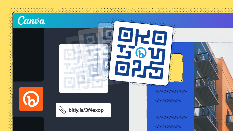
That’s why we’re so excited to streamline your workflow by bringing the power of Bitly and Canva together with our new integration. Now you can seamlessly turn all of your Canva presentations, menus, flyers, graphics, ads, and more into actionable assets by adding Bitly QR Codes and Short Links to your designs without ever having to leave the platform.
We know you’re excited to save time and start making more connections thanks to this new integration—and we are too! That’s why we’re sharing best practices for powering up your Canva designs with Bitly. Learn how to create assets that strike the perfect balance between artistry and efficacy, and get ready to watch all those scans and clicks roll in!
Make your design composition cohesive
When incorporating Bitly QR Codes and Short Links into your designs in Canva, you’ll want to keep some age-old design principles in mind, like striving for visual harmony. Always consider the overall visual composition of your design when adding QR Codes to your graphics, just like you would when designing any asset.
Distribute elements strategically so you can ensure viewers consume the most important information first. Sure, you might really want your audience to scan your QR Code right away, but that doesn’t mean it should be the most prominent element in your composition! Strive for a visually appealing design that achieves its main objective by playing with font size and typography to add emphasis to certain elements, and make sure your QR Code sits naturally within your design.
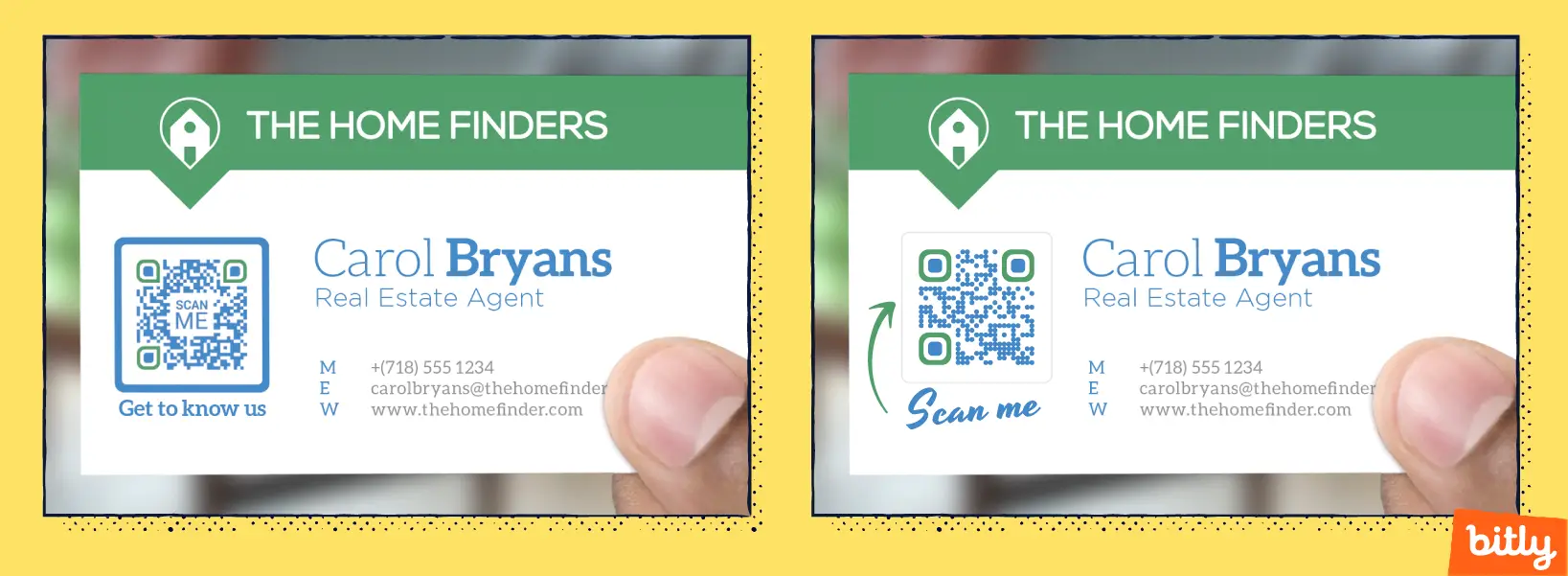
With the Bitly + Canva integration, you can easily change the color of your Bitly QR Code right within Canva while you’re working on your design. Be sure to customize the appearance of your QR Code so that it aligns with your brand colors, logo, and other elements present within the design to maintain a cohesive experience for your audience.
Best practices for making your design cohesive:
- Review the overall composition of your design and aim for clarity over clutter
- Guide the viewer’s eye by leaning on your design element’s hierarchy
- Customize your QR Code in Bitly by adding patterns, corners, gradients, and more
Keep QR Code contrast and context in mind
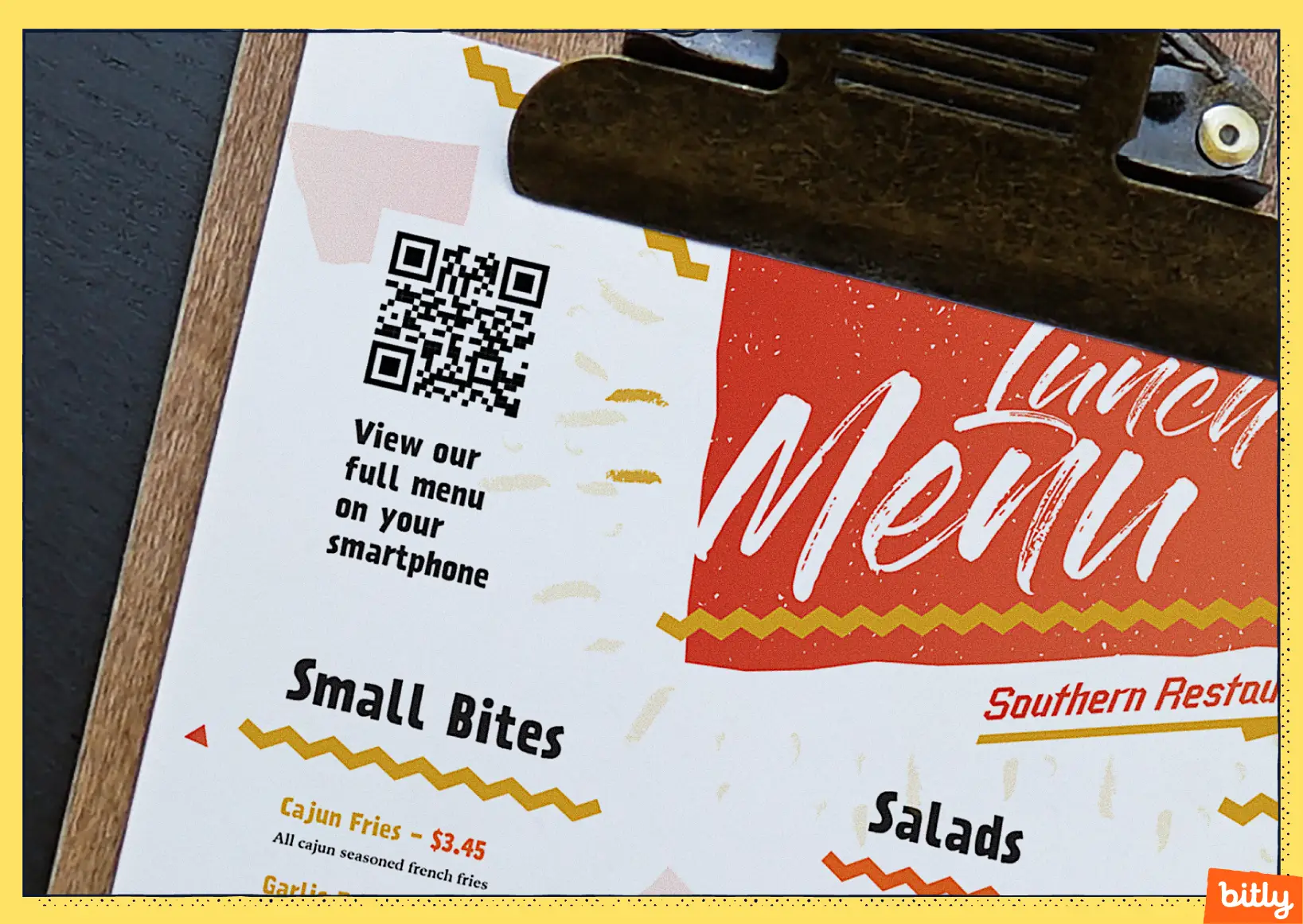
It’s important to always design with contrast and context in mind, and this is particularly true when you’re adding QR Codes to your designs. When adding Bitly QR Codes to your assets, make sure to provide enough contrast between the QR Code itself and the background of your design. This makes it easier for viewers to spot the code and also helps with scannability.
Pick colors that are in contrast with one another and keep in mind that colors may vary slightly after printing, so when in doubt make it pop! Be sure to test your QR Code and ensure it’s pointing to the right link before it’s off to the presses. You can also create a Dynamic QR Code, which means if redirects are part of your Bitly plan, you can simply change the link and the destination of the QR Code—without reprinting.
Think about where this asset will be seen, how it will be engaged with, and what you want your audience to do next. For example, if you’re designing a poster or flyer for an upcoming event, adding a Bitly QR Code that leads to the event’s registration page can entice viewers to secure their spot right from their mobile devices. On the other hand, if you’re promoting your event on social media, it might make more sense to incorporate a memorable short link into the asset since people will already be on their phones or a computer when they view it.
Best practices for keeping contrast and context in mind:
- Highlight the most important information based on your design’s main goal
- Provide enough contrast between your Bitly QR Code and background for scannability
- Always test your QR Code to ensure it points to the right location before printing
- Test your Bitly QR Codes when printing designs as colors may vary slightly
Brand and customize your short links
With Bitly, you can set up a custom domain to replace the “bit.ly” in your links with a name of your choosing and edit the back-half of your links to give people a preview of where you’re sending them. Rather than adding a long and generic URL to your asset or graphic, take advantage of creating and customizing your Bitly Short Links.
A short, memorable link is much easier to remember or type into a browser than a clunky, unwieldy one. Plus, when you customize your short links to accurately reflect the content or destination they lead to, you instill more trust in your audience which encourages clicks. Remember to keep your customizations short and sweet and keep case sensitivity in mind.
Let’s say you’re pitching a new product or service to a potential client and you want to showcase some customer success stories related to your offering in your presentation. Adding a branded short link to the deck makes it easy for viewers to remember the destination so they can explore the testimonials at their leisure. Not only will this make the presentation look sleek, but it will add a layer of professionalism and polish to your pitch. Small details can make a big difference!
Best practices for leveraging Bitly Short Links:
- Keep it short to make your links easier to remember and share
- Make your short link clear, concise, and consistent—one-syllable words work best
- Use active words that are easy to pronounce
Provide a specific call-to-action
Your call-to-action (CTA) is a critical element within your design that drives your audience to take a desired action. It’s the cherry on top of your beautiful Canva asset, urging viewers to scan your customized QR Code or click your short link. Remember, a well-crafted CTA can turn passive viewers into engaged ones, so make it enticing and relevant!
When designing your asset in Canva, we recommend ensuring your CTA stands out visually from the rest of your design. As we mentioned before, it’s important to keep contrast and context in mind—and that applies to ensuring your CTA does its job, too. Use contrasting colors, bold fonts, or buttons to draw attention and make it stand out.
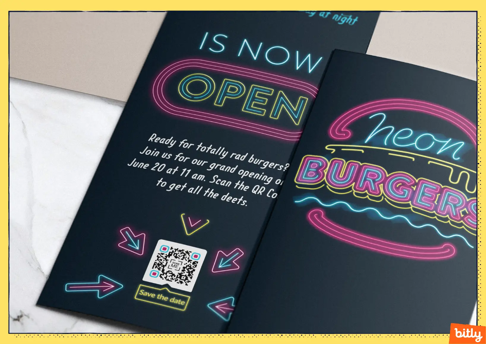
Encourage your audience to take that extra step with crystal-clear CTAs. We recommend being specific and direct, using verbiage like “Save the date” or “Sign up today,” depending on what you want your audience to do next. Strong CTAs can boost engagement and keep your audience coming back for more.
Best practices for crafting calls-to-action:
- Use action-oriented language that entices them to take the next step
- Tailor your CTA to resonate with the interests and desires of your target audience
- Place your CTA strategically within your design so that it stands out
Monitor and track performance across assets
Maximizing the impact of your Canva designs with Bitly QR Codes and Short Links goes beyond simply incorporating them into the mix. Tracking performance is key to unlocking valuable insights you can leverage to improve the effectiveness of your assets in the future. We recommend regularly monitoring clicks and scans to discover which designs are performing best and driving their desired outcome.
By leveraging Urchin Tracking Module parameters, or UTMs, you can get detailed insights into the sources and mediums that drive traffic to your digital destinations. Add UTMs to the links that power your Bitly QR Codes so you can make data-driven decisions that drive better results. We suggest looking at click-through rates, scan rates, and conversions to fine-tune your designs for maximum impact. Plus, with Bitly, you can view performance across paid, earned, and owned channels, and see where your audiences are engaging down to the city level.
Best practices for tracking performance:
- Add UTM parameters to the links you use to power Bitly QR Codes in your designs
- Use the click-and-scan data to optimize your visuals, CTAs, and messaging
- Stay agile in your approach and be open to adapting your designs based on data
A/B test and iterate on your designs
Simply put, an A/B test is a method used to compare two or more variations of a design or marketing element to determine which one performs better. We recommend adopting this test-and-learn mindset to ensure you’re putting your best foot forward with all of the assets and materials you create.
Design is an iterative process, after all, and A/B testing your creations is a great way to discover what resonates best with your audience. When it comes to integrating Bitly QR Codes and Short Links into your Canva designs, A/B testing can provide valuable insights that lead to higher engagement rates and stronger audience connections.
Always start with a clear objective—what do you want to achieve with your design? Then, be sure to only test one variable at a time. For example, if you’re A/B testing two QR Code designs, keep all other elements constant and then measure the performance of each version. Maybe a certain color draws more attention or the placement of the QR Code is impacting scans—either way, choose one element to test to limit other variables that may impact your results.
Try to segment your audience into equal groups so that each one only sees one variation and set a timeframe for how long you’ll test these two versions. Analyze the performance, implement the winning design, and as always, keep the spirit of iteration alive for future designs!
Best practices for A/B testing designs:
- Identify what specific element you want to test like the color of your Bitly QR Code
- Create two versions of your design but be sure to only change one element
- Compare the performance of each variation using Bitly’s click-and-scan data
- Test new variations over time to optimize your designs further
Start using Bitly and Canva together today
Ready to take on the world of design with the Bitly + Canva integration? By following these best practices, you can make more meaningful connections with your audience through beautifully designed assets that encourage action.
We’re really excited about this integration and can’t wait to see what you all create with the power of Bitly and Canva together. Be sure to visit our Help Center for step-by-step instructions on how to connect your Bitly account to Canva. Happy designing!