If knowing your customer inside and out is the lifeblood of a successful business, then data is the beating heart that keeps it moving in the right direction. After all, making strategic decisions based on data is non-negotiable these days. With so many different ways to connect with customers, you really can’t afford to rely on guesswork.
Regardless of industry or company size, one thing is true—collecting, analyzing, and leveraging data effectively can be a challenge. With so many different data sources to consider and tons of channels to report on, extracting valuable insights from all of these touchpoints can be quite the puzzle.
That’s why we’re so excited to share that Bitly Analytics is here to bring you data that is simply insightful. Now you can see how your connections—from QR Code scans and short link clicks to landing page visits—are performing all in one place. With customizable charts, flexible data visuals, and downloadable data, you can easily review and analyze your campaign performance at a high level and then zoom into the details.
Bitly Analytics 101: What you need to know
Did you know that on average Bitly customers manage upwards of 16 short links and QR Codes across three to four channels within a single campaign? Now that’s a lot of data to explore! And while we’ve always offered a view of individual short link, QR Code, and landing page performance within the Bitly Connections Platform (like clicks and scans), the new Bitly Analytics dashboard lets you view aggregate results across all of your connections.
Let’s dig into what metrics you have access to, what types of charts you can create, and how you can start tapping into all of this data today!
Key metrics and insights to leverage
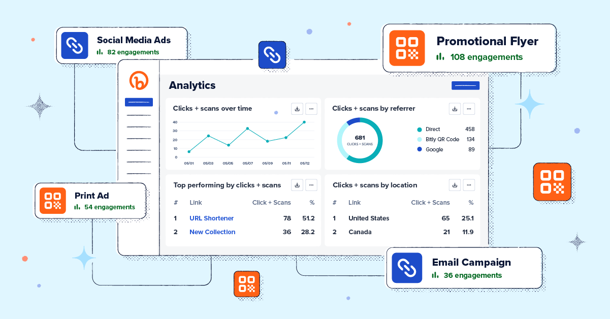
Whether you’re looking for a high-level overview of click and scan performance, cross-landing page performance insights, or a deep-dive click-by-click, Bitly Analytics has you covered. Engagement data is available for all of the links, QR Codes, and Link-in-bio pages created in your account. You can view aggregate engagement data for all the links, QR Codes, and landing pages created within the Connections Platform or drill down to see specific engagement data for each.
The Analytics dashboard offers two types of dashboards:
- Links & QR Codes
- Landing Pages
Links & QR Codes comes with a set of default modules, which show:
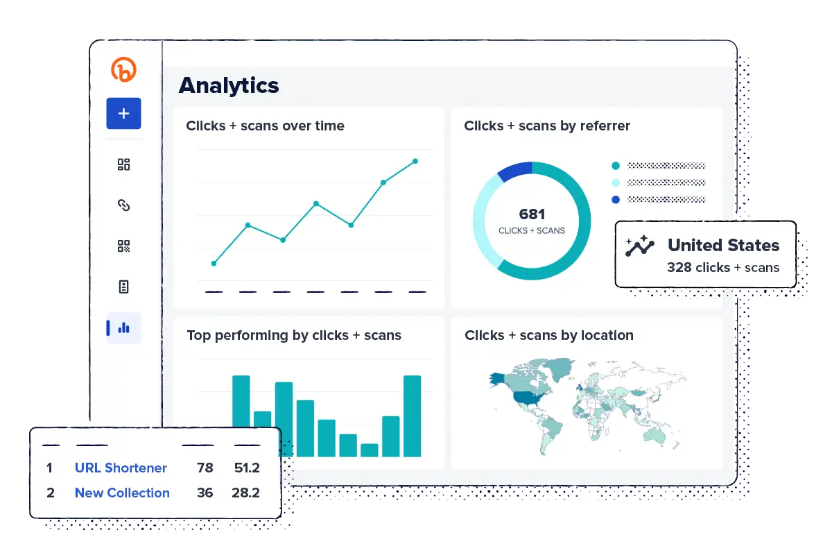
- Clicks and scans over time
- Clicks and scans by referrer
- Top performing by clicks and scans
- Clicks and scans by location
On top of views data, Landing Page dashboards come with this data:
- Page button/link clicks by day
- Page button/link clicks by location
- Page button/link clicks by device
This data gives you insight into the performance of all your connections—when and where are your links being clicked? What engagement patterns can you see? What page layout and design inspires the most clicks? And how can you leverage this data to double down on what’s working and pull back on what’s not?
For example, let’s say you’re running an advertising campaign in key markets across the country and are using Bitly QR Codes to drive traffic to a landing page from each ad. You can use real-time scan data by location to uncover where your most engaged audience is geographically. Use Landing Page performance to see which buttons are getting the most clicks. Then, tailor your campaign based on these insights and explore how you can encourage action in less-engaged areas. Knowledge is power!
Chart types and customizations to explore
When you first navigate to your Analytics dashboard you’ll have the option to create either a Links & QR Codes dashboard or a Landing Page dashboard. On both types, you’ll see a number of beautiful pre-made charts ready for you to explore. In a pinch for time? Skip the hassle of creating charts from scratch and download a pre-populated chart to add to your next presentation! If you are interested in editing and filtering the data available within Bitly Analytics (which we highly recommend!) then you’ve come to the right place.
Each chart module can be downloaded in your preferred format—like a PNG, JPEG, PDF or CSV file—so you can easily share your visualization wherever you like or even plug the raw data into your database or dashboard of your choice.
Here are the chart types available in Bitly Analytics:
- Performance over time: Customize your view by filtering the data so you only see views, clicks and scans for a select number of links or pages—up to 100 at a time! To add an extra layer of granularity, filter your dashboard by date so you can track changes in performance over time. Within the Landing Page dashboard, you can compare clicks and views data over time.
- Location: Leverage Bitly Analytics to identify geographic regions that are experiencing a surge in clicks or scans. Then, delve deeper to determine which links are generating the most engagement.
- Website referrers: Identify which specific channels effectively drive users to your online destinations. This data highlights the channels and tactics that are resonating most with your audience, giving you intel on where to potentially invest further.
- Devices: Bitly users with Premium plans can delve into click and scan data by device type. This means that at a glance, you can see which types of devices your audience members use most to engage with your brand. For example, if most people are clicking through from their mobile devices, maybe it’s time to optimize your website!
- Top performing: See which links have garnered the most engagement overall in a ranked view and uncover the percentage a particular link contributes to the total interactions. This is a great way to identify the most successful links within your entire account so you can see what people are loving and what could use a little extra attention.
- Overview (Landing Page dashboard): Landing Page dashboards also include an overview module showing total views, clicks, and Click-Through Rate metrics.
Not only can you review and report on your clicks and scans from multiple angles, but you can also visualize results in the chart type that best matches the data. Choose from the following visualization options: Line, Table, Doughnut, Bar chart, Scorecard, or Map.
Pro-tip: All of the modules you see within Bitly Analytics are customizable by metric, chart, or visualization type. That means you can filter your data so you only see views, clicks, or scans for a select number of links—up to 100 at a time!
How to access Bitly Analytics within your account
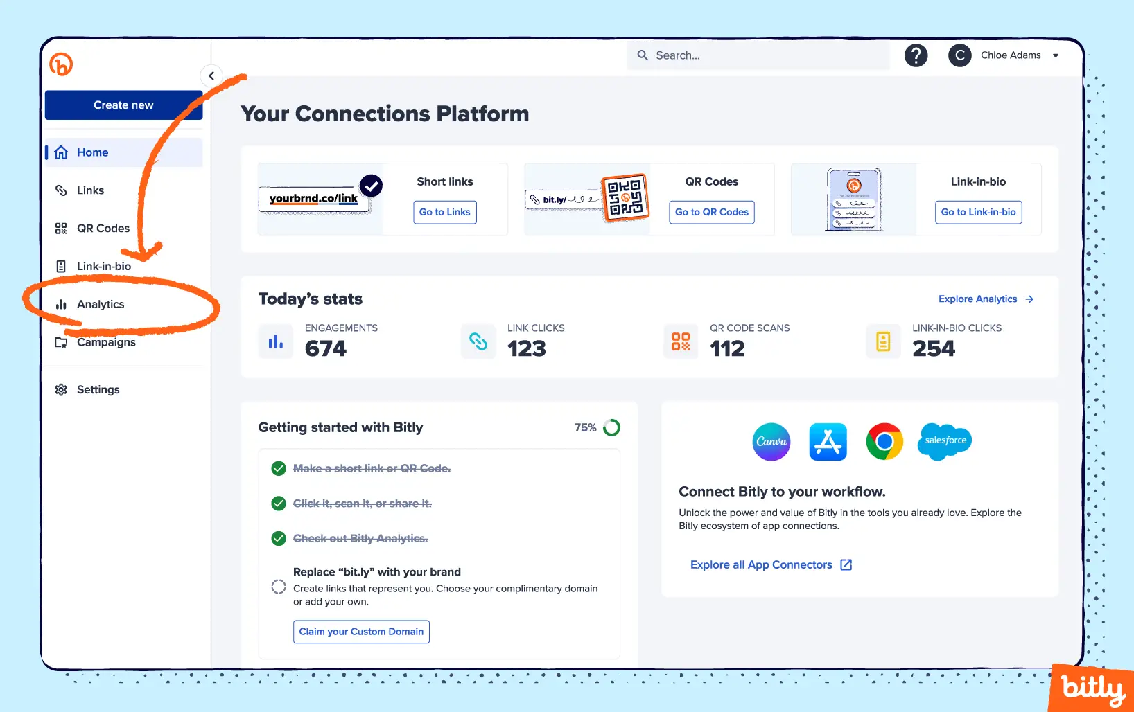
Ready to dive into all the data? Bitly Analytics is available on all paid plans. To view your dashboard, simply login to your Bitly account and select Analytics in the left sidebar. Select Create New Dashboard and choose the dashboard type: Links & QR Codes or Landing Pages. From there, the dashboards show view, click, and scan data across time, by device and referrer, and by location—but don’t forget to customize the charts to your heart’s content!
The amount of data available to you depends on your subscription plan. To view your account’s limits, visit the billing and usage section within your account settings.
Insightful analytics—no certification required
We’re super excited about the new Bitly Analytics dashboards and hope you are too!
We’re always working on making it simple and easy to access a wealth of data within the Bitly Connections Platform, so keep an eye out for more from us on this front. Making more informed decisions about how you’re connecting with your audience shouldn’t require a special degree. Luckily, with Bitly Analytics, tracking and analyzing all your connections in one place is now a breeze.
Getting started with Analytics
Check out the Analytics section of your Bitly account or sign up today to get started with Bitly Analytics. Analytics is available for all paid plans, putting the power of effortless data analysis in your hands.
Visit our pricing page to find the plan that best suits your analytical needs and start unlocking the potential of your data today.


