An app landing page is more than just a webpage; it’s your high-converting storefront for mobile growth. In the fast-paced digital landscape of 2026, user experience on mobile devices is paramount. Whether you are launching a SaaS startup, a real estate platform, or a new ecommerce web app, your landing page design must be instant, intuitive, and hyper-personalized.
The best landing page strategies now leverage AI-assisted design tools to optimize performance without the need for complex HTML, CSS, or Bootstrap code. From a compelling hero section and crisp typography to persuasive testimonials and screenshots, every pixel counts when driving traffic from social media or SEO campaigns.
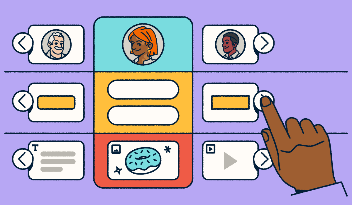
In 2026, app marketers need more than just great visuals; they need connected, data-rich landing pages that adapt to every channel. Bitly Pages stands out as the go-to no-code, drag-and-drop solution for marketers who want a fast, trackable way to deploy mobile app landing page campaigns. With fully customizable landing page templates, you can streamline pricing tables, checkout flows, and signup forms to boost functionality and optimization.
Ready to turn website visitors into loyal users on Android and iOS? Learn how to create a landing page with Bitly that elevates your call to action and maximizes installs.
Note: The brands and examples discussed below were found during our online research for this article.
What is an app landing page, and why does it matter?
An app landing page is a dedicated destination designed with a singular focus: Turning interest into installs. These pages do more than just display content. They serve as the nexus of your marketing ecosystem. By integrating seamlessly with cross-channel analytics, Dynamic QR Code campaigns, and precise UTM tracking, a modern app landing page ensures the correct attribution of every click and scan, giving you a clear view of your ROI.
Unlike a generic website or a restrictive app store listing, a dedicated landing page allows you to control the narrative. Today’s most effective pages utilize AI personalization to adapt content in real-time and automated testing to refine headlines and visuals continuously. This approach ensures your value proposition resonates immediately, whether the user is arriving from a TikTok ad or a physical billboard.
Why is this critical? Because it bridges the gap between curiosity and commitment. For example:
- Spotify Wrapped expertly uses web-to-app experiences to generate viral sharing before driving users back into the mobile app.
- Notion leverages mobile onboarding pages to showcase specific use cases, reducing friction for new users.
These examples demonstrate how a strategic landing page offers rich context, like interactive previews or exclusive offers, that a standard app store description simply can’t match. The answer to the question “Do landing pages increase lead conversion?” is a resounding yes.
Core elements of a high-converting app landing page
Every high-converting app landing page has a single goal in mind: encouraging potential users to install or engage with your app. Unlike a generic webpage, these landing page designs strip away distractions and guide website visitors toward one clear outcome.
In 2026, the best designs combine clean layouts, subtle motion elements, and privacy-first CTAs (like “Get started securely”) to build immediate trust. By combining strong visuals, optimized copy, and social proof, you can dramatically increase app downloads while maintaining a seamless user experience on mobile devices.
App Store Listing vs. App Landing Page
| Feature | App Store Listing | App Landing Page |
| Goal | General distribution | Targeted conversion & marketing campaign tracking |
| Design | Rigid, platform-defined layout | Fully customizable web design & branding |
| Analytics | Limited platform data | Full cross-channel analytics & pixel tracking |
| Content | Static text & screenshots | Interactive demos, video, & rich media |
Compelling headline and subheader
Your headline is the first thing potential customers see, so it needs to capture attention instantly. A strong header should explain in plain language what the app does and why it matters. Look at top performers like Duolingo (“The free, fun, and effective way to learn a language”) or Calm (“Sleep more. Stress less. Live better.”). The best app landing page designs masterfully balance emotional benefit with clear functionality.
In 2026, savvy marketers use AI-assisted design tools to run A/B tests on copy variations automatically. Supporting subheaders should round out the hero section, adding clarity and reassuring users they’re in the right place. Clear headers not only improve app download conversion but also strengthen SEO, ensuring you rank for queries related to your specific SaaS or ecommerce niche.
Brief app summary with visuals
Once you have attention, provide a short app summary. In modern web design, interactive demos or scroll-based animations that show the app in action often replace static images. Whether you are using Figma prototypes, Webflow exports, or AI preview tools, the goal is to create instant context.
Keep it scannable. Rather than listing every feature, emphasize outcomes: Faster checkout, easier real estate browsing, or automated workflows. Crucially, ensure accessibility standards are met with high text contrast and descriptive alt text, ensuring an inclusive user experience. Showing the app in action on iOS or Android devices via high-quality screenshots or mockups gives potential customers confidence in its utility.
App store call-to-action buttons
Your call to action (CTA) button placement is the engine of your increased conversion rate. While you must include platform-specific buttons like “Download on the App Store” and “Get it on Google Play,” 2026 trends also point toward Progressive Web App (PWA) install prompts for a lightweight web app experience.
Personalization is key. Modern landing page templates often detect the user’s device to serve a specific prompt like “Get it on your iPhone.” With tools like Bitly Pages, you can utilize dynamic link routing. This means a single “Download Now” button automatically sends mobile users to the correct store for their device, while desktop users might see a QR Code. Repeat these buttons throughout the single-page layout, especially after benefit-driven sections, to maximize optimization.
Social proof and testimonials
Trust is the currency of conversion optimization. In an era of skepticism, generic quotes don’t cut it. Refresh your social proof with 2026-appropriate elements: Verified Trustpilot badges, embedded influencer quotes from social media, or user-generated content (UGC) carousels showing real people using the app.
For a startup or new mobile app landing page, even a short line like “Rated 4.9 stars by 10,000+ users” can reduce friction. If your app has been featured in major publications, display those logos prominently. Using Bitly Analytics, you can track exactly how often users engage with these testimonial sections, helping you refine your landing page design inspiration based on real data.
Optional content blocks (FAQs, features, etc.)
While simplicity is key, adding optional sections can remove barriers to entry.
- Security & Privacy: Explicit assurances about data protection and permission transparency are now essential for fintech or health apps.
- Pricing: If you have a freemium model, a simple pricing comparison table can highlight the value of upgrading versus the free tier.
- Collapsible FAQs: To maintain a clean mobile-first UI, use collapsible accordion menus to answer questions about integrations or functionality without cluttering the page.
The key is balance; long pages aren’t always better. Focus on choosing value props for landing pages that strengthen your app’s specific benefits. Ready to build a stunning, trackable landing page in minutes? You don’t need a developer or complex code. Learn how to create a landing page with Bitly and launch your campaign today.
Tips to optimize your app landing page design
You don’t need to be a web design expert to create a high-converting app landing page. In fact, in 2026, the biggest optimization gains will come from data-driven insights and AI-assisted tools that refine user experience with A/B testing in real-time. Whether you’re launching a brand-new mobile app landing page or updating an existing one, these strategies can help you capture more app downloads, increase conversion rates, and maximize the ROIs of your marketing campaigns.
Prioritize mobile responsiveness
The majority of potential users will reach your landing page from mobile devices, often through social media ads, email, or search.
This means responsiveness isn’t optional; it’s essential. Beyond basic scaling, modern landing page design embraces “foldless scrolling,” dark mode optimization, and adaptive typography to ensure readability in any environment. Place key elements like screenshots and call to action buttons within thumb-friendly zones for easier navigation. You can even check Bitly Analytics’ dashboard to see exactly which devices and operating systems your website visitors use, allowing you to tailor the single-page experience perfectly.
Keep CTAs visible and repeated
A single call to action (CTA) button isn’t enough to drive conversions. Visitors may scroll through app features, testimonials, or pricing tables before making a decision. To catch them at the moment of interest, implement sticky CTAs that remain visible as they scroll, alongside contextual “micro-CTAs” (like “Join 50K+ users”).
Repeat platform-specific buttons for iOS and Android after major content sections and near the footer. With no-code tools like Bitly Pages, you can ensure visual consistency and easily integrate these prompts without touching CSS or HTML. Strong, action-driven text like “Download now” keeps your buttons compelling and consistent.
Limit distractions
Your app landing page should serve one purpose: Getting potential customers to download the app. Too many links, menus, or competing visuals dilute that goal. In 2026, optimization also means technical performance: Prioritize page speed with lazy loading visuals and a seamless privacy banner UX that doesn’t obstruct content.
A distraction-free, minimalist landing page design acts as a major trust factor, particularly for fintech, real estate, or health apps. By using clean landing page templates that strip away outbound links, you help potential users focus entirely on your value proposition and signup flow.
A/B test layout and copy
Improving conversion rates often comes down to testing small changes. Modern A/B testing leverages AI-driven insights to automate optimization without needing complex development or the custom code often required by platforms like WordPress or Webflow.
Experiment with different headlines, hero section imagery, or screenshot placements. You can test different CTA shapes, icons, and color contrast using Bitly Campaign analytics to see what resonates with your target audience. Testing doesn’t have to be complex; start with one change at a time, and soon you’ll have a firm understanding of how landing pages increase lead conversion.
Use Bitly Pages to build and scale app landing pages
For mobile growth, app landing pages can’t just look good. They need to convert. In the competitive 2026 ecosystem, this means they must be instantly deployable, equipped with AI-powered templates, and capable of cross-platform deep linking.
Bitly Pages is the definitive no-code, mobile-first landing page builder designed to help teams drive app downloads without friction. Whether you’re scaling a SaaS platform or a web app, you need a solution that bridges the gap between engagement and installation. By centralizing your landing page design, QR Code generation, and link management, you can create high-speed, conversion-focused experiences without needing advanced web design skills or heavy developer lift.
Fast setup with branded short links
Bitly Pages allows you to go from idea to published landing page in minutes. Instead of wrestling with complicated HTML or expensive website design tools, you can use our drag-and-drop builder to highlight your app features, screenshots, and hero section.
Critically, every page should anchor with a Branded Link. In an era where phishing is a major concern, branded domains can improve click-through rates by signaling trust and legitimacy to website visitors. Whether utilized in social media bios or as the targets of printed QR Codes, these links reinforce your brand before the user even clicks.
- 2026 Use Case: A wellness app increases installs by 42% by using Bitly’s A/B optimized service booking landing page templates to rapidly test different value propositions.
Optimized for mobile and tracking
Since the vast majority of your audience arrives via mobile devices, Bitly Pages offers mobile responsiveness by default. Layouts automatically adapt for smaller screens, ensuring typography is legible and CTA buttons are thumb-friendly.
Beyond layout, measurement is key. Bitly Analytics now aligns with privacy-first standards (compatible with GA4 workflows), giving you a granular view of every click without compromising user data. You can compare device types, OS usage rates, and traffic sources by city or country in real-time.
- 2026 Use Case: A real estate platform uses Bitly’s device-level data to discover that Android users in coastal cities converted 2x faster, allowing the firm to shift ad spend immediately.
Designed for multi-channel installs
Modern campaigns are rarely single-channel. With Bitly Pages, you can create multiple landing pages tailored to specific workflows: A video-heavy page for TikTok ads, a pricing-focused page for email funnels, and a streamlined signup page for SMS blasts.
Because each page integrates with Bitly UTM parameters, you can attribute every install to the correct source. This setup eliminates the guesswork, helping you double down on the channels that actually drive growth.
- 2026 Use Case: A gaming app promotes a new level via their TikTok bio using a dedicated Bitly Page. By tracking the specific link, they attribute 15,000 direct installs to that single social channel.
Get started with a better app landing page
The best app landing pages aren’t complicated. They’re clear, mobile responsive, and focused on one goal: Driving installs. With the right structure offering compelling headlines, app features, strong CTA buttons, and valid social proof, you can turn website visitors into loyal users.
Bitly Pages helps you launch smarter, scalable, and data-driven landing pages designed for today’s multi-channel world. You don’t need design expertise or heavy development work. You don’t even need to know how to create a landing page. Our no-code page creator makes it simple to publish polished landing pages in minutes, pair them with branded short links, and track every click with Bitly Analytics.
Ready to build a high-converting app landing page that scales with your marketing campaign? Try Bitly Pages free today and start creating smarter, faster, and more effective landing pages now.


