
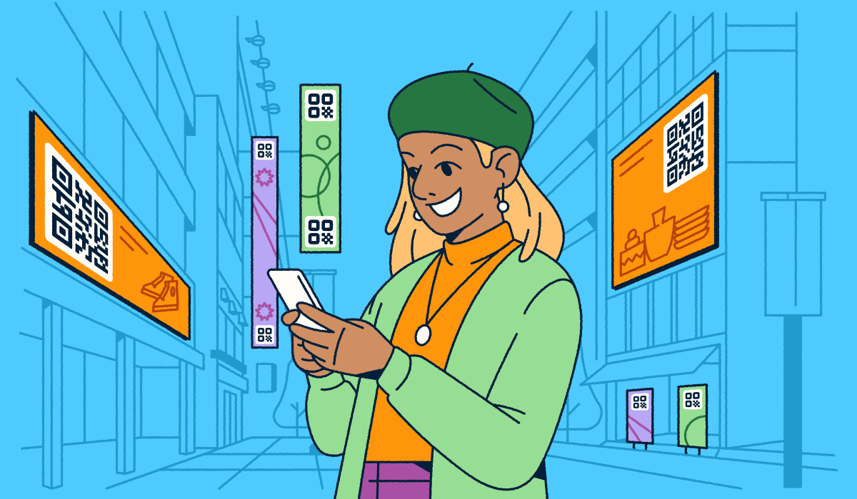
The choice should be simple: A plain-looking black-and-white square or a code that mimics your branding. A branded QR Code is a scannable code customized with your colors, logo, frame, and pattern so it reflects your brand while still effortlessly linking to your destination. That design work pays off; QR platform data suggests branded codes get anywhere from ~25% to several times more scans than plain ones. QR Code scanning is now mainstream, with 89 million Americans scanning codes in 2022, so the codes your potential customer sees need to earn attention and trust at a glance to differentiate them in a densely populated marketplace.
The catch is that branding and scannability can pull against each other. Push the design too far, and the code stops reading; play it too safe, and the code disappears into the page. This guide shows you how to find the sweet spot, from custom QR Code design and logo placement to color, frames, and real-world testing, so your codes look enticing and scan the first time correctly.
Key takeaways
- Design a QR Code that reflects your brand’s colors, logo, and frames to build recognition and trust at every scan.
- Balance branding with scannability, because branded codes get anywhere from ~25% to several times more scans than plain ones when they still scan reliably.
- Keep a logo to roughly 30% of the code, center it, and use as much error correction as possible so scanners still recognize the pattern.
- Protect the quiet zone, use high color contrast, and test every code on real devices before you print or publish.
- Choose Dynamic QR Codes so you can update the destination anytime and track scans in Bitly Analytics.
What is a branded (creative) QR Code?
A branded (creative) QR Code is a scannable code customized with colors, a logo, a frame, and a distinct pattern so it reflects the look of a specific company while still linking to a digital destination using a recognizable format. Generic codes can blend into the background of your design and get overlooked. A creative QR Code design signals who you are before someone scans, building recognition the same way a logo or a color does.
Color alone can carry a brand. People recognize McDonald’s golden arches and Starbucks’ green without reading a word, and your QR Code can borrow that same shortcut. When a code looks like it belongs to you, it feels trustworthy, and that trust shows up in results.
The difference is easiest to see side by side. A standard code communicates nothing until someone scans it, while a branded code sells the value of each scan before it happens. Use the comparison below to weigh what each type offers before you design your own branded QR Codes.
| Standard QR Code | Branded QR Code | |
|---|---|---|
| Appearance | Plain black-and-white square | Custom colors, logo, and frame |
| Brand recognition | None | Instantly tied to your brand |
| Trust | Feels generic or anonymous | Signals a legitimate source |
| Scan engagement | Baseline scan rate | More scans than unbranded codes |
| Design integration | Clashes with your creative | Matches your visual identity |
Design with the destination and use case in mind
Match the design and size of a QR Code to where people scan it and what they get afterward. A code on a product label, a piece of signage, a business card, and a phone screen each face different lighting, materials, and scan distances, so the right size and contrast change with the context. Plan the design around the placement first, then customize the look to fit your brand.
The reward on the other side of the scan matters just as much as the placement. Someone scanning packaging in a store wants product details fast, while someone scanning an event banner wants a schedule or a signup. Decide what the destination delivers before you design the code, so the visual promise and the payoff line up.
Visual QR Code elements you can customize
QR Code customization features let you style nearly every visual aspect of a QR Code to match your brand. With Bitly Codes, the design options include:
- Pattern: Choose from nine module styles, including dots, boxes, and hybrid shapes, to change how the code reads at a glance.
- Corner style: Pick from more than 10 corner (finder pattern) styles, such as circles, squares, ovals, and combinations, to shape the code’s “eyes.”
- Color: Apply exact brand colors with hex codes, gradients, or transparency.
- Frame: Add a frame with a call to action (CTA) like “Scan Me” or “Get Offer” to tell people what to do.
- Logo: Drop your logo into the center of the code to make it unmistakably yours.
These options let you create designer QR Codes and creative QR Codes that still scan reliably. Mix and match them with intent rather than using every setting at once. Pair your primary brand color with a complementary pattern, keep corner styles consistent across a campaign, and reserve unique text frames for the moments where a CTA earns its extra space.
If you’re comparing tools, our roundup of the best free QR Code generators walks through what to look for.
How to add a logo without breaking the scan
QR Codes store redundant data so a scanner can still read them when part of the code is covered or damaged. That built-in tolerance, called error correction, is what makes a custom QR Code with a logo possible. Follow a few rules to keep a custom QR Code logo from breaking the scan:
- Limit the logo to roughly 30% of the code’s surface area or less.
- Use the highest error correction level available for your encoding.
- Center the logo so the surrounding pattern stays intact.
- Keep the logo clear of the three corner finder patterns (the “eyes”).
Placed this way, the logo strengthens your brand without hurting scan reliability. Reliability matters, because 28% of consumers already say QR Codes are too slow or unreliable to bother with. A code that scans cleanly on the first try can keep that quarter of your market engaged.
You can use social icons as well: Drop an Instagram, LinkedIn, or YouTube mark into the center of your QR Code to point people toward a specific channel. Just keep it within the 30% limit and use a high-resolution, properly sized export file for printing or display. A crisp, well-placed mark reads as intentional, while a blurry or oversized one reads as broken.
How to choose colors and contrast
Scanners need clear separation between light and dark to read a QR Code’s data pattern, so contrast is the single most important color decision you make. A dark code on a light background is the most reliable combination. When the code color is too close to the background color, scanners can struggle or fail entirely.
Use hex codes to match your exact brand colors, and add gradients for a more distinctive custom QR Code design. Keep the contrast high, whichever palette you pick. A frame or a solid background box behind the code can boost contrast when your brand colors are too light.
Direction matters with gradients. Use a dark gradient pair on the code modules and a light pairing if you have a gradient in the background. Avoid placing two mid-tone brand colors against each other, since a scanner reads the boundary between them as noise rather than a clean edge.
Transparent backgrounds work well for digital overlays, but test them against every background they’ll sit on. Protect the quiet zone too. It’s the clear margin of empty space around a QR Code that lets scanners detect its edges.
Contrast and colors also change with the medium. A palette that reads perfectly on a bright screen can wash out on matte packaging or glossy signage under store lights. When brand guidelines lock you into light and low-contrast color pairs, add a dark frame or invert the code so the pattern is still cleanly separated from its surroundings.
Frames and CTAs that drive scans
A short, verb-led instruction paired with a frame tells people exactly what to do and what they’ll get. “Scan Me” works as an evergreen CTA, and you can swap in seasonal or offer-based prompts like “Scan for 25% off” during campaigns. Guidance still helps, because 25% of consumers remembered needing help the first time they scanned a QR Code.
Test different frame styles and CTAs to see which drives more scans, then track the results in Bitly Analytics. Small wording changes often move scan rates more than you’d expect. Run two versions of the same campaign, keep everything but the frame identical, and let the scan data pick the winner.
Be sure to match the promise in the frame with the payoff on the other side. If the frame says “Get 25% off,” the destination should open straight to that offer, not a generic homepage. A tight loop between the CTA and the landing experience builds the trust that turns a first scan into many.
Static vs. Dynamic QR Codes
A static QR Code encodes a fixed destination URL, while a Dynamic QR Code lets you change the destination anytime without reprinting. That flexibility makes Dynamic QR Codes the better fit for most branded campaigns, which can change over time. They also let you track scans over time, referrers, location by city and country, and device types in Bitly Analytics.
Dynamic QR Codes fit any campaign that evolves:
- Retail: Point a code to new collections as inventory turns over.
- Events: Update a code with the latest schedule or venue details.
- Real estate: Send one code that updates with current listings as they change.
- Healthcare: Route a single code to cover appointment, intake, and ongoing interaction.
A dynamic code also protects the work you’ve already printed. If a link breaks or a promotion ends, you edit the QR Code destination instead of reprinting every label, sign, or card. That flexibility makes Dynamic QR Codes the practical choice for small businesses that can’t afford to reprint with every change, and smart enterprises that are equally concerned with value.
Branded short links and landing pages for the post-scan experience
The scan is only the start of the experience. A branded short link leading to a Bitly Pages landing page keeps everything after the scan looking the same, so the destination feels as intentional as the code itself. Together, they turn a single scan into a connected, trackable journey.
Our URL Shortener lets you create branded short links like yourbrand.co/summer that build trust and reinforce recognition before anyone even scans. Bitly Pages lets you build no-code, mobile-friendly landing pages that match your brand and track engagement, so you control the full path from scan to action.
The best part is that you can keep the whole workflow inside the tools you already use. With the Canva integration, you drag branded codes straight into your designs, and Bitly Analytics ties every scan back to the code, link, and page it came from. That connected view turns every one-time scan into a data point you can act on.
QR Code design tips by placement
Size, contrast, and placement should shift based on where a QR Code lives. The right setup for a business card fails on a billboard, so design each code for its surface and scan distance. You can also use QR Code stickers to place codes cleanly on surfaces where printing directly isn’t practical.
Business cards and direct mail
Business cards and mailers give you a small canvas and a close scan distance, so precision matters more than size. Keep the code print-friendly and free of clutter.
- Minimum size: 0.8 by 0.8 inches so a phone camera can lock on at close range.
- Contrast: Keep strong contrast on colored or textured card stock.
- Placement: Position the code away from folds or edges.
Packaging and product labels
Packaging art fights the code for attention, and curved or glossy surfaces distort the data pattern. Give the code room and give people a clear reason to scan.
- Curved surfaces: Keep the code small enough that curves and small labels don’t distort it.
- Quiet zone: Protect adequate white space around the code on busy packaging.
- Testing: Add instructional messaging like “Scan for ingredients,” and test the code under real retail lighting.
Events and signage
Signage gets scanned from a distance, so size and height drive whether people can reach the code at all. Build in extra scale and clear sightlines.
- Minimum size: One inch by one inch for documents and two by two or larger for signage and distant scanning.
- Scan distance: Scale the code up for anything meant to be scanned from across a room. One inch of code size for every one foot of scanning distance is a good general rule.
- Height: Place signage codes at a comfortable scanning height, and test in real conditions with bold, high-contrast frames.
Common QR Code design mistakes to avoid
Avoid these design mistakes that quietly cost you scans:
- Making the code too small to scan at the intended distance.
- Using low-contrast brand colors that blend into the background.
- Breaking the quiet zone by crowding the code with text or graphics.
- Overloading the code with a logo larger than ~30% of its area.
- Placing the code on busy or reflective backgrounds.
- Using Static QR Codes for campaigns that change, instead of dynamic ones.
- Skipping real-world testing before printing or publishing.
Design QR Codes that get scanned and stay on brand
Great branded QR Codes reflect your brand, protect scannability, and connect the scan to a destination that feels intentional. Start with your colors, logo, and frame, keep contrast high and the quiet zone clear, then point the code at a branded short link or a Bitly Pages landing page. Test every code on real devices, and choose Dynamic QR Codes so you can update and measure as you go.
Design is a loop, not a one-time task. Watch how your branded QR Codes perform in Bitly Analytics, then refine the color, frame, or destination based on what the scan data tells you. The best-designed code is the one your audience scans again and again.
Get started for free and design your first branded QR Code today.
Frequently Asked Questions
How do I make a branded QR Code?
Choose a QR Code generator, enter your destination, then customize the color, pattern, frame, and logo to match your brand. With Bitly, you can create a QR Code in seconds, download it in print-ready formats, and track every scan in one dashboard.
Can a QR Code have a logo in the middle?
Yes. A QR Code can hold a centered logo as long as the logo covers no more than about 30% of the code and you use a high error correction level. Error correction lets scanners read the code even when part of it is covered, so a small logo can be visible without breaking the scan.
Do custom QR Codes still scan reliably?
Yes, when you design them with contrast and clearance in mind. Keep strong contrast between the code and its background, protect the quiet zone, and test the code on real devices before you publish. QR platform data suggests branded codes get anywhere from ~25% to several times more scans than plain ones, so thoughtful branding can improve results rather than hurt them.
What size should a QR Code be?
Match the size to the scan distance. Use at least 0.8 in for business cards, 1×1 in for documents, and 2×2 in for signage, then scale up for anything meant to be scanned from farther away.
Are Dynamic QR Codes better than static ones for branding?
For most branded campaigns, yes. A Dynamic QR Code lets you update the destination anytime without reprinting, and it tracks scans in Bitly Analytics. A static code fixes the destination permanently, which works for one-time uses but limits ongoing campaigns.
How much does a custom QR Code cost?
Bitly’s Free plan includes QR Codes with basic customization, and advanced customization like a custom logo, colors, frames, and patterns is available on paid plans. You can compare options on the Bitly pricing page.





