
When you hear the term “ROI,” (short for return on investment, as a refresher!) does your inner data nerd get excited or do you start sweating? Are you eager to dive deep into marketing analytics at a moment’s notice or do you struggle to explain how valuable your campaigns are for building awareness, boosting engagement, or even driving revenue?
If the idea of putting together a slideshow for a C-suite bigwig or your agency’s most impressive client makes you shake in your chair, you’re not alone. A 2021 survey from Allocadia revealed that 47% of North American marketers struggle to calculate marketing ROI. Still, the same research found that a whopping 96% of companies use ROI to measure marketing effectiveness.
Whether you’re tasked with showing your boss how well your most recent campaigns worked or need to convince a client that their trust in your marketing agency is well-placed, you need data to show your work. Ready to get out of the guessing game and start proving your marketing ROI with the numbers to back it up? We’ll break down the challenges of calculating ROI, some of the tools that can help, and six tips for showcasing your undeniable results with Bitly Analytics.
Measuring marketing: The great data debate
For years, marketers have referred to their field as both an art and a science. Marketing is inherently creative, bringing together subjective elements like copy and design. But it’s also quite objective, as success is often measured by impact on revenue. Whether the latter is done through website traffic, lead generation, or bottom-line sales, marketing is measurable—and this quantifiable aspect is key in proving it’s “working” as it should.
Knowing the numbers behind your marketing efforts (and using the data to tell a story!) is probably just as important as actually creating and executing campaigns. Data reveals critical patterns, information about your audience’s preferences and engagement, which channels work best for your brand, and what’s not working. And since customer data helps you reach your audience more effectively, knowing your numbers inside and out makes you a better marketer.
Data is a must-have for showing that the dollars spent on your efforts—from advertising to contractors—are worth their weight in gold. Whether you’re presenting to your boss or a client, data storytelling is one of the most important skills to master when showing how effective your marketing campaigns are.
Today’s challenges for proving marketing ROI
Measuring your marketing effectiveness isn’t an overly simple task. Here are a few reporting challenges that might sound familiar to you (especially if you’re a small and scrappy business—there’s no shame in that game!):
- Collecting data from all the various tools in your tech stack can be a hassle—it’s time-consuming and can be tough to create a cohesive picture with the data.
- Confusing, unintuitive dashboards (or tools that lack analytics altogether) are a pain to deal with. And if they don’t offer customizable reports? Forget about it!
- Digital attribution is getting tougher—as third-party cookies die out and more customer engagement happens via “dark social,” a lot of data goes undetected, so you can’t report on it, either.
- Offline channels (think physical and outdoor advertisements or in-store impressions of your product) have always been a sore spot when it comes to reporting. They’ve historically been virtually untrackable.
- It can be hard to see the patterns in your data. How much of the big picture do you need to show the impact of your efforts? How detailed is too detailed?
Data collection is no joke, but it’s too important for marketers to ignore. To help give you a jumping-off point, we’ll dive into some tips and tricks for how to effectively report on and prove your marketing ROI with the help of Bitly Analytics.
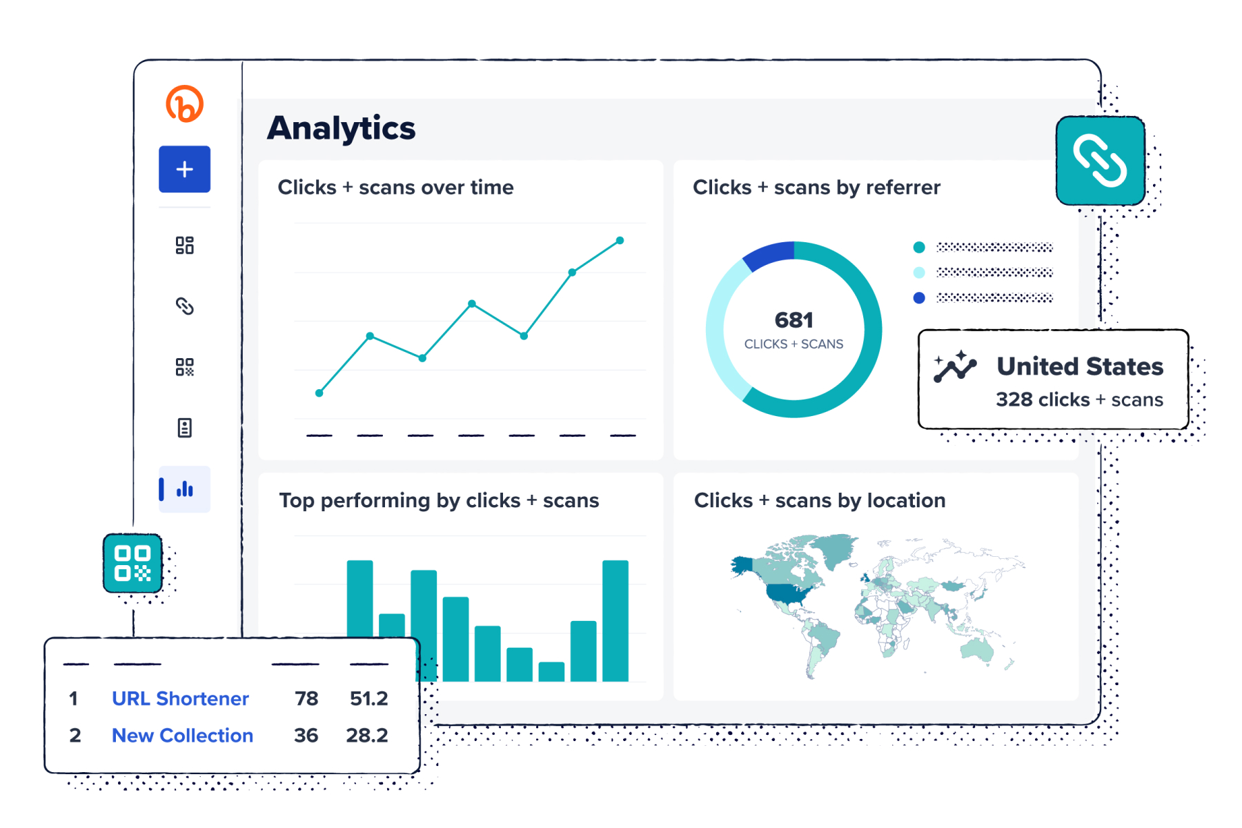
Proving ROI with Bitly Analytics
You asked, and we answered! Bitly Analytics is here to let you see how all your connections are performing in one place, from QR Code scans to Short Link clicks. With customizable charts, flexible data visuals, and downloadable data, you can easily review and analyze your campaign performance at a high-level and then zoom into the details. That means when it’s time to report back on ROI, you can quickly get the insights you need to show how each and every connection impacted the bottom line.
Not only does Bitly Analytics let you see trends in real-time, but it also gives you valuable audience data about where they’re clicking or scanning from and which products or messaging they’re engaging with. Look at overall data trends or dig deeper to analyze the performance of one specific QR Code or link. Then, use those insights to improve performance by strategically incorporating high-performing links or CTAs into your marketing campaigns to reach customers at the right time.
With Bitly Analytics, marketers can easily track, manage, and analyze both online and offline engagement in one central location, making it easier than ever to make data-backed decisions while optimizing resources and investments.
Use Bitly Analytics to showcase ROI: 6 tips
Your next big presentation doesn’t have to be as stressful as trying to get tickets for your favorite artist’s concert. With Bitly Analytics, you can quickly review your results and use them to tell compelling stories backed by data. Use these six tips to ace your next presentation and prove marketing ROI in seconds!
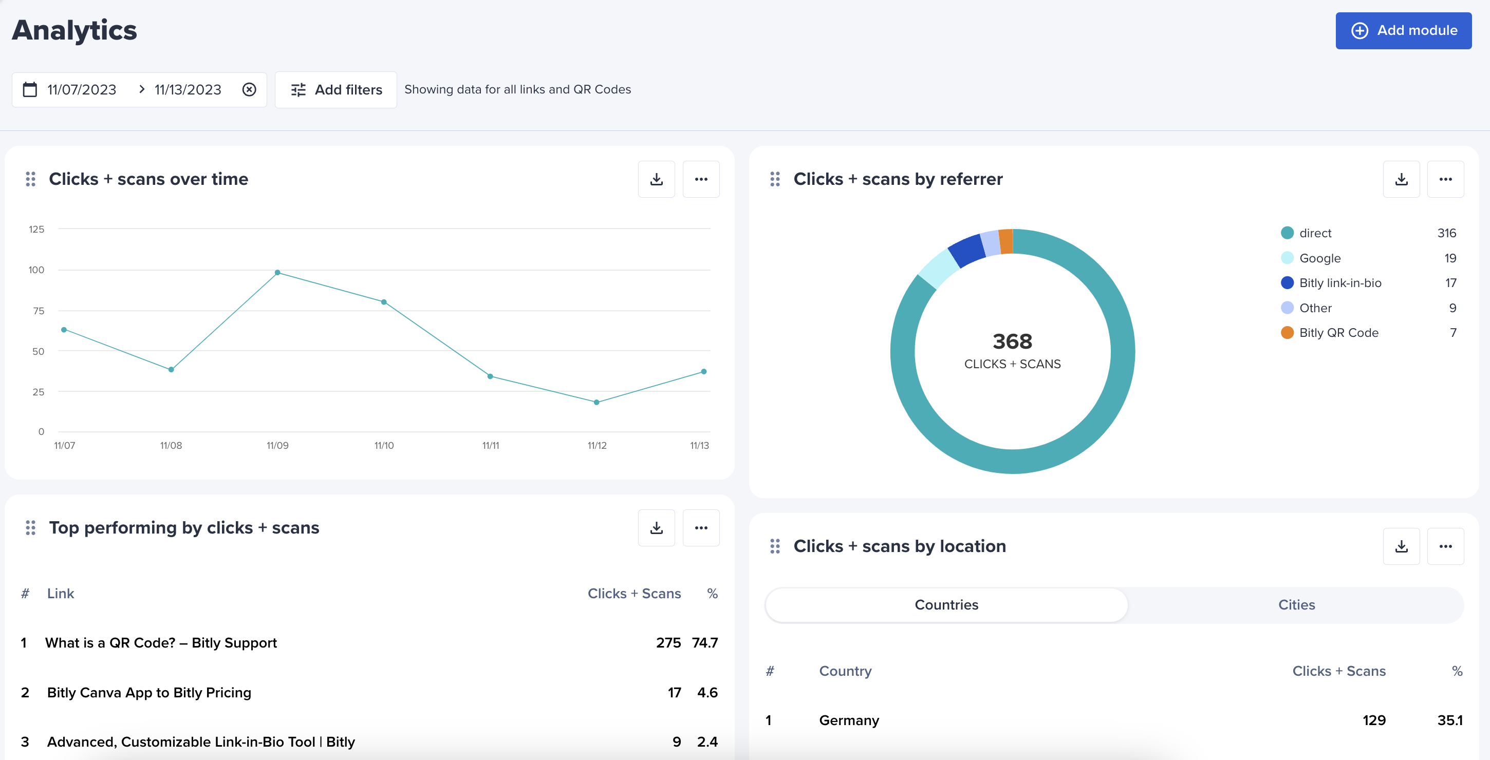
1. Start with the big picture, then zoom in
When presenting data, begin with the big-picture trends. This approach gives your audience context and clarity before you present a deeper dive into the specific strategies that worked well.
Bitly has always offered data on individual Short Links and QR Codes. But with Bitly Analytics, now you can start with a data overview right from your dashboard—and then get detailed.
After you share about overall performance, highlight notable numbers that signal your best-performing campaigns. You can also point to any outliers or underperforming campaigns and explain your plans to run tests or make changes to improve them.
2. Don’t just say it, show it
Of course, your C-suite execs and clients care about how effective your marketing efforts have been. But you still need to keep them engaged and interested in what you’re saying, especially if you’re sharing a lot of numbers. Without a thoughtful and engaging presentation, you might lose their attention, or they might lose track of the most important findings. That’s why visuals are so important.
Bitly Analytics lets you download images straight from the dashboard that you can drop into your slides. You can also export the data as a .csv file if you’d like to put it into a spreadsheet or create your own graphic. Vivid or colorful visuals give people something engaging to look at and let them quickly grasp what’s working well.
Don’t overload a slide with too many visuals at once, either—that gets overwhelming. Try to make a particular point with each slide, using the visual that tells that story the best.
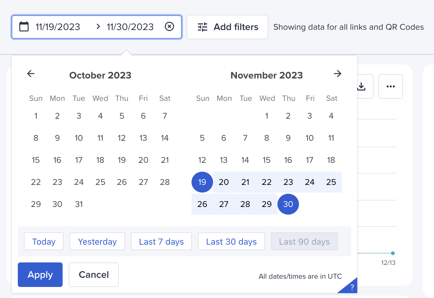
3. Get historical
When it comes to proving your marketing prowess, digging into the historical data using Bitly Analytics is a smart move. Depending on your plan, you can go back as far as 90 days to compare different snapshots of time and see how your marketing efforts are performing. Are people scanning your QR Codes? How many people are tapping on your SMS Short Links?
Identify trends over time and see what’s been working well and what could use a little extra attention. Think of it like a before-and-after snapshot—you can point out how certain actions or campaigns affected clicks, scans, and engagement rates, giving you the data needed to back up your success story. Showcase the lessons you’ve learned from the past and how those can help make future campaigns even more of a home run.
Within Bitly Analytics, you can adjust the date range to show change over a month or quarter and easily export that data so you can keep a record of performance over an even longer period of time.
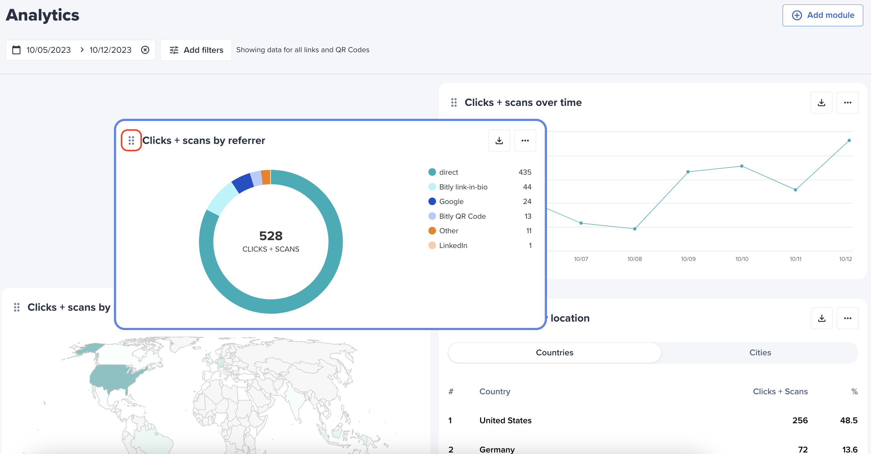
4. Look at the data differently
Most metrics lend themselves better to some formats than others—certain findings look best as a bar chart, while others shine in a table format. That’s why Bitly Analytics lets you create modules with different data visualization formats so that you can pick the one that looks best.
You may find that it makes sense to share the same numbers in multiple ways. For instance, you might have rich international location data, so you might export both a global heat map of clicks and scans and a table that shares that same data by the numbers. That way, your audience can wrap their heads around your results in multiple ways.
5. Spell out key findings
You’re an expert in your team’s campaigns. So when you look at a chart sharing how clicks and scans changed over time, the impact and takeaways might be glaringly obvious to you—but not necessarily to a busy exec or client. Highlight key findings and standout statistics by circling or labeling spikes in performance on charts.
In Bitly Analytics, there’s a module for exactly that. You can create a scorecard to highlight notable data points. Did you have a successful product launch that drove sign-ups or purchases? Call out clicks during that first week. Did you knock it out of the park with this year’s Black Friday Cyber Monday campaign? Pair the data on increased QR Code scans and Short Link clicks with the steps you took to make those numbers happen in a succinct callout they won’t be able to miss.
With every finding, clarify which changes you made to drive those positive results. Plus, pull revenue data from your other tools during the same time period to show exactly how your campaign drove sales.
6. Be clear about what’s next
If you want to knock it out of the park during your next reporting presentation, make sure you end with what’s next. Recap the most important takeaways and summarize the findings from the data, then share what actions the marketing will take based on those insights.
Did Instagram stand out as the leading referrer to your website on your Bitly Analytics dashboard? Consider increasing your advertising budget next quarter on that platform to capitalize on growth. Or maybe you tried reaching your audience through Google ads, but your campaigns didn’t perform as well as you had hoped. Change up your targeting strategy moving forward based on what you learned about your audience. If one country or city made a strong showing, talk about how you’ll focus on more regional ads—digitally and in-person—in the months to come.
Data drives better decisions, so show your client or leadership how you’ll use the data to spend your marketing budget even more effectively going forward and bring even more ROI the next time you present.
Understand your marketing ROI today
That monthly, quarterly, or yearly reporting presentation can be intimidating, but it doesn’t have to be. With Bitly Analytics, you get the big-picture data you need to tell the story of your marketing efforts and prove your results and ROI. Show the impact of your digital and offline marketing channels, get to know your audience, and make better decisions.
Your clients and boss will be impressed, and they’ll sleep better at night knowing their marketing is in good hands. Plus, you’ll sleep better knowing you have the numbers to prove it.


