In our information-saturated world, people are exposed to information nonstop. While you can’t control the amount of information external players, like social media sites, throw at your target audience, you can control what they encounter on your site.
Microsites are a smart way to boost your online presence without overwhelming your target audience with too much information. They’re also the perfect tools for targeted marketing, as they carry fewer distractions than main websites. Businesses can use them for various purposes, such as enhancing brand engagement and meeting specific campaign goals.
Skeptical? Read on for an in-depth dive into their benefits for targeted campaigns and some examples of microsites to ignite your creativity and help you get started.
What is a microsite?
With the average human attention span at only 8.25 seconds, businesses must find creative ways to get their messages across fast enough. That’s where microsites come into play.
A microsite is a smaller website—with its own domain—consisting of one or more pages. The purpose of a microsite is different from that of a website; rather than presenting all business-related information, it’s focused on a single initiative.
Its primary purpose is to promote a brand’s individual campaigns or offerings independent of everything else a main website may display. You can use it in digital marketing strategies to promote an event, inform your audience about new products or services, supplement brand marketing campaigns, improve lead generation efforts, and target specific audiences.
The advantages of microsites for targeted campaigns
We know what you’re thinking—why create a microsite when you already have a well-performing website? While this may be the case, your primary website may limit you from reaching your full potential in specific campaigns, as it’s most likely information-saturated.
Microsites are simple and targeted and, as such, can better help you share specific messages. Here are some reasons to use them for targeted campaigns:
Focused messaging
Microsites allow for highly focused and streamlined content tailored to a specific campaign or promotion. Whether you want to create a buzz around a specific event, shine the spotlight on a new product, service, or improvement, or launch a new campaign, these small websites are exactly what you need. Their focus on specific messages helps avoid the distractions of a full-scale website.
While microsites and landing pages are different, they share some of the same elements. So, borrow some tips from landing pages that convert and include headlines, some visual elements, and a clear call to action (CTA) to communicate your message, improve the user experience, and simplify the user journey toward intended actions.
Creative freedom
Do you feel like your main company website limits your creativity? While there are many benefits to maintaining consistency in website design—such as boosting familiarity and improving the user experience—it can be pretty restrictive and limit your ability to experiment with different elements.
Microsites can offer greater creativity flexibility. They provide the freedom to break away from the constraints of the main corporate branding and explore different aesthetics or creative themes that are specifically aligned with a campaign’s goals.
You can experiment with an innovative design, add multimedia content you wouldn’t typically use, incorporate interactive elements, and even change your typography or color palettes without altering your main site.
Audience targeting
If you have multiple products or services, chances are, you have multiple target audiences. While this may be great for your business, you may not get the most out of each one if you rely solely on your main website to create brand awareness. Microsites can help!
You can design them with a very specific segment of your market in mind, allowing for personalized content that speaks directly to a targeted demographic. They even allow for tailored SEO strategies to attract niche audiences and improve rankings, positioning you better in front of each audience. You can use more niche-specific keywords and create content that addresses each audience’s pain points, helping your microsite stand out.
Enhanced metrics for campaign analysis
Because of their small scope and specific focus, microsites facilitate more precise measurement of visitor behavior and engagement metrics. This precise data collection is critical for evaluating the effectiveness of your targeted campaign. Some key metrics to assess include:
- Page views: This metric measures the number of times visitors load your microsite. It can help you determine if your SEO efforts are working.
- Time on site: The amount of time visitors spend on your page can tell a lot about your content’s engagement.
- Conversion rates: The number of people who complete desired actions—this could be purchasing your product, signing up for a newsletter, and so on.
- Specific interactions with content elements like videos or downloadable resources: These could help you assess your content’s engagement.
For in-depth insights, leverage tools like Bitly and Google Analytics. Bitly Campaigns can show you the number of people clicking on each microsite (if you create multiple microsites for your campaigns), while Google Analytics can highlight visitor behavior, providing a well-rounded view of your performance.
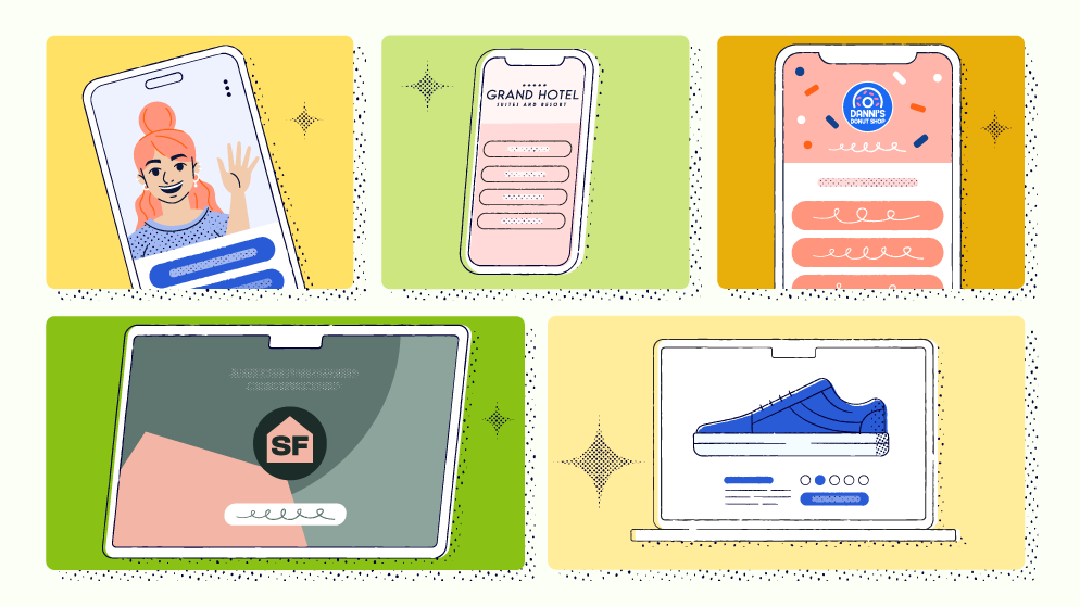
8 of the best microsite examples out there
To provide you with a visual reference of a successful microsite and spark your inspiration to begin your own, we’ve handpicked eight microsite examples that can serve as models.
Note: We found the examples below during our online research.
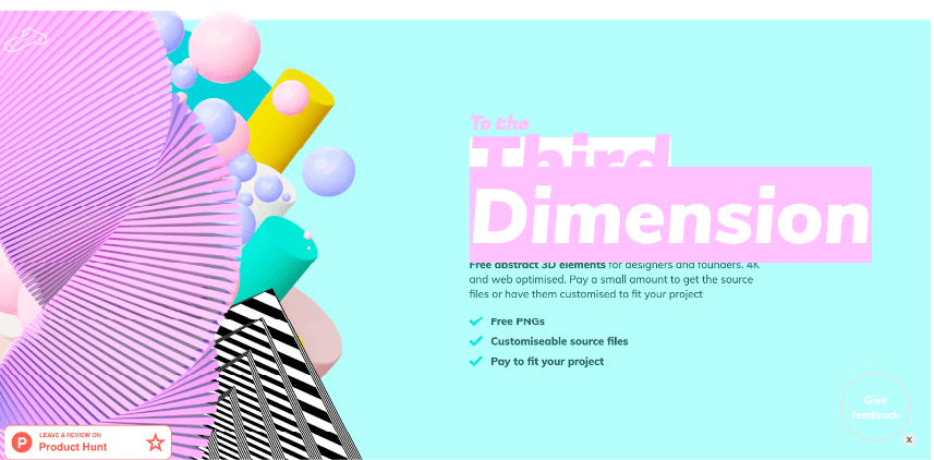
1. To the Third Dimension
As you navigate this microsite, the visually stunning abstract images featuring obscure shapes and a kaleidoscope of colors will instantly draw you in. Created with designers in mind, this resource hub provides a collection of exquisite abstract 3D images, along with customizable source files available for purchase, allowing designers to tailor them to their unique projects.
For users on the go, accessing these 3D images is a breeze—simply click on the arrow icon, and a new page opens up where you can instantly download the PNG files from Google Drive.
The microsite’s layout is intentionally user-friendly. As you scroll to the bottom of the page, you have two options: delve into the FAQs for more information or reach out to the creator via email or Twitter (X) for any inquiries.
Key takeaways: This microsite example catches your eye not only with its striking visuals but also its intuitive navigation. It’s a reminder of the timeless wisdom that simplicity is key, a principle that holds particular importance for microsites.
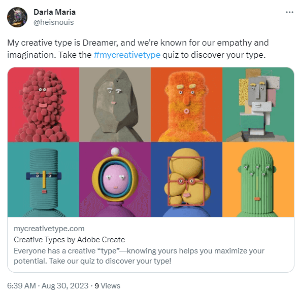
2. My Creative Type
Adobe’s inventive microsite, “The Creative Types,” presents a creative interactive personality quiz. Upon completing the quiz, you receive your results and a fun animated character that represents your unique personality type.
You can download and share your results using the social media icons.
Key takeaways: This microsite example is a reminder that microsites can be both fun and a bit unconventional to boost engagement. Plus, its social sharing feature encourages users to share their creative personality types with friends, co-workers, or fellow creatives, further enhancing engagement.
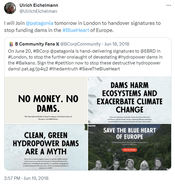
3. Blueheart Patagonia
Shining a light on its cause, Patagonia partnered with the Farmers League to craft a microsite known as Blueheart Patagonia. It initiated this campaign to raise awareness about safeguarding the endangered Balkan dams, which are the last remaining wild dams in the region.
The rivers that course through the Balkans are often referred to as the “Blue Heart of Europe.” Hence, it’s perfectly apt that the microsite makes this message crystal clear by displaying the words “Blue Heart” in big, bold letters as soon as users land on the site.
Key takeaways: This microsite focuses entirely on a specific message—dam protection—highlighting the role of microsites in focused messaging. It does a great job using call-to-action buttons to encourage users to watch the documentary and discover more about the regions, including their impact on the local people and biodiversity.
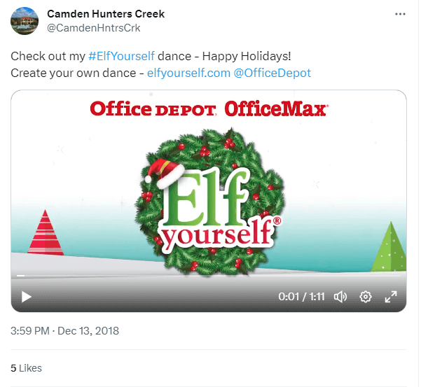
4. Elf Yourself
Introduced in 2006, this playful and interactive microsite engaged users right from the start, enabling them to “elf themselves” by uploading the faces of their dogs, co-workers, family members—basically anyone—and transforming them into dancing elves. These elves certainly knew how to bust a move!
Users had the freedom to choose from a range of themes, including Charleston, Honky Tonky, the ‘80s, and more, to put these dancing elves to the test. Afterward, they could share the microsite link with friends and family, spreading the Christmas cheer.
Key takeaways: This microsite example lends its success to its social sharing feature, the active involvement of participants, and, unsurprisingly, the sheer comedic charm it exudes. It’s the kind of experience that makes you say, “I had no idea Grandma could break dance like that,” making it instantly likable and shareable.
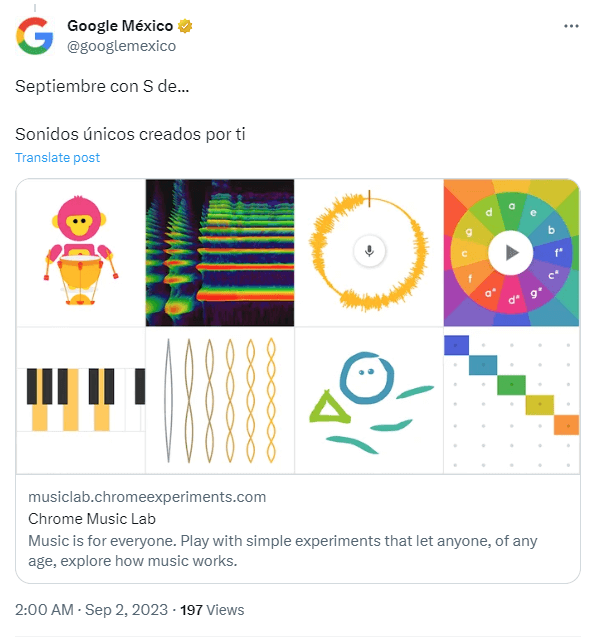
5. Chrome Music Lab
The Chrome Music Lab is an experimental microsite designed to democratize music creation, making it accessible to a wide audience. This microsite is entirely free, allowing users who want to explore music to experiment with chords, melody makers, sound waves, and more!
Teachers have embraced the Music Lab in their classrooms, elevating music lessons and adding depth to subjects like science and math. Plus, it’s a lively tool for sprucing up the classroom and complementing activities like dance and live instrumental performances.
What’s even more exciting is that you can share the music you create through links or by using the hashtag #chromemusiclab to initiate conversations on social networks.
Key takeaways: Microsites as dynamic and engaging as this inspire user participation across all age groups, sparking curiosity and a sense of excitement for something new and different.
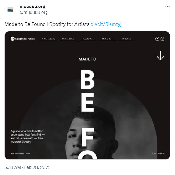
6. Spotify‘s Made to Be Found
This microsite, aptly named “Made to Be Found,” serves as a guide to help artists comprehend how listeners discover their music on Spotify.
The microsite menu provides artists with a treasure trove of resources and insights, covering everything related to having your song featured on Spotify, how listeners discover songs on their “Made for You” playlists, and so much more.
Toward the bottom of the page, in the “What’s Next” section, artists find a prominent call-to-action button labeled “go to dashboard.” This button enables them to directly access and view audience engagement metrics for their music.
Key takeaways: Spotify designed this microsite with a specific audience in mind: artists. It provides them with valuable resources not only to gain insights into their audience’s music streaming habits but also to learn how to pitch their music and expand their fan base.
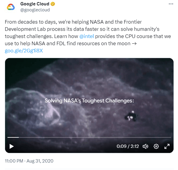
7. NASA
This microsite effectively presents the Frontier Developmental Lab’s (FDL) research using expert cinematography, 3D visuals, and immersive sound effects. Curious visitors can delve into this world and discover how Google Cloud and artificial intelligence predict and respond to pressing natural disasters like floods, ensuring a quicker and more effective evacuation process.
The microsite is divided into several pages, organized like a conventional website but with enhanced interactivity. Users can engage most actively by scrolling through the content. The homepage provides an overview of the challenges, highlighting the sun, the moon, and the Earth, each presented in 3D with accompanying video clips. Users can then explore these topics individually by watching the related videos one by one.
Key takeaways: This microsite provides an engaging journey, delving into complex subjects but not without leaving users with a sense of hope and optimism. It’s an effective tool for raising awareness about the challenges currently confronting NASA and its ongoing efforts to find innovative solutions.
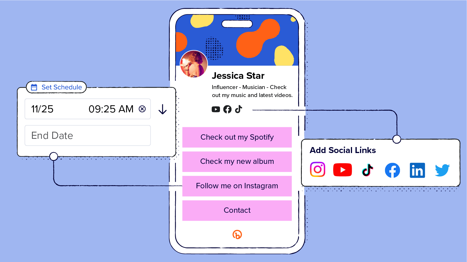
8. Jessica Star’s Link-in-bio
Jessica Star, a fictional musician and influencer, set up a microsite using the Bitly Link-in-bio feature. This allows her to showcase selected social icons and links, making it easy for her followers to explore her music-related content.
By adding this Link-in-bio to her TikTok bio, her followers can simply tap on it to access a wealth of information embedded in the link—from her Spotify page to her YouTube channel. This makes it super convenient for her fans to discover her music without the hassle of searching.
Plus, it gives Jessica more control over how her followers find her content, allowing her to direct them to the most relevant channels for her music.
Key takeaways: This microsite example demonstrates the power of minimalism in a compact website. It contains all the information needed to engage a social media audience and direct them to the content that matters most.
Construct your microsite on Bitly’s platform
A microsite is the perfect solution for running targeted marketing campaigns, new product launches, lead generation, and event marketing. As you’ve seen from our examples, key aspects to focus on when building your own microsite include an intuitive user interface, engagement, buyer personas’ unique needs, and CTAs.
If you want a microsite that’s easy to set up, fully customizable, and simple to track, Bitly is your go-to solution. You can use the Bitly Link-in-bio feature for a compact microsite design, as well as track your site’s effectiveness and visitor engagement through the Bitly Connections Platform.
Create a Bitly account today to build your microsite and gain actionable insights into its performance for continuous improvements!


