A year ago, we embarked on a journey to create a first-of-its-kind platform that would seamlessly combine all of our core product offerings—Link Management, QR Codes and Link-in-bio—into a single, unified space backed with the analytics and simplicity that are synonymous with the Bitly name. We wanted to build a platform that could truly be the catalyst for all of your connections.
Today, the Connections Platform empowers your brand or business growth, saves you time, helps you work more efficiently, and continues to evolve to meet your needs. As we’ve worked to understand what our customers want and need the most, we heard you loud and clear: the current design, the look and feel, is harder to use than it should be. It can be difficult to find things, it didn’t feel modern, and it could be strenuous to read, especially in low light and on some devices.
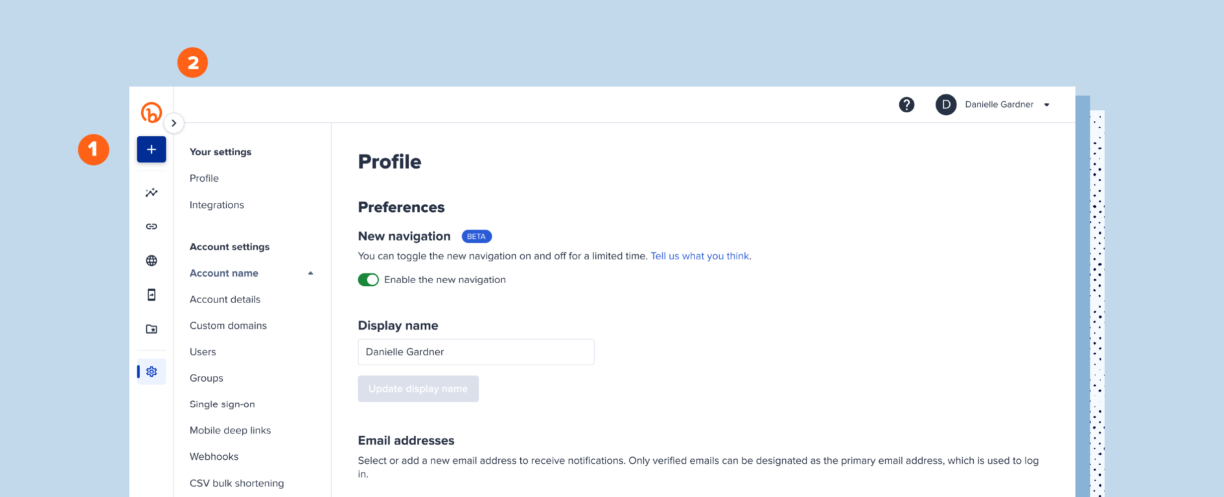
We are thrilled to introduce you to our new design experience; we hope you like the new look as much as we do and find it even easier to use! Interested in giving it a try? Go to your Profile in your Settings section and toggle on “Enable the new navigation”—it won’t give you that new car smell, but you can still enjoy the clean lines of modern design that’ll go the distance! Here’s to making every connection count!
If you want a preview of the changes, keep reading. We’ve got you covered!
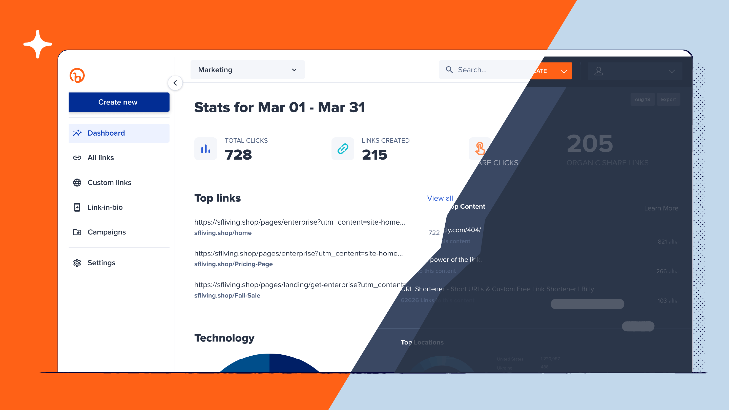
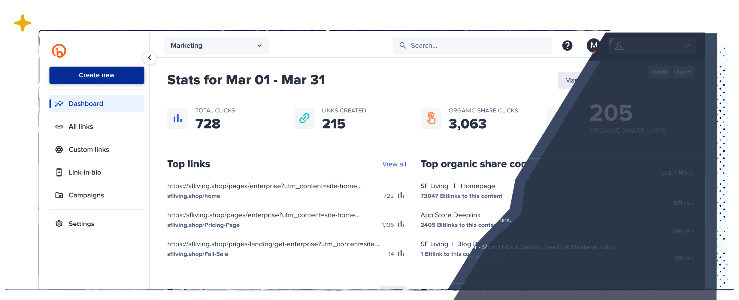
It’s Like Night and Day!
We’re not sure about you, but some of our Bitizens (Bitly team members!) are complete night owls! While we love the nighttime and thrive in the wee hours of the morning, taking that night owl approach to our color palette doesn’t work for everyone or every screen.
One of the biggest changes you’ll notice is the bright, light new color palette. While our night owls may have some adjusting to do, we don’t think they’ll find it annoyingly chipper.
Find Things Faster
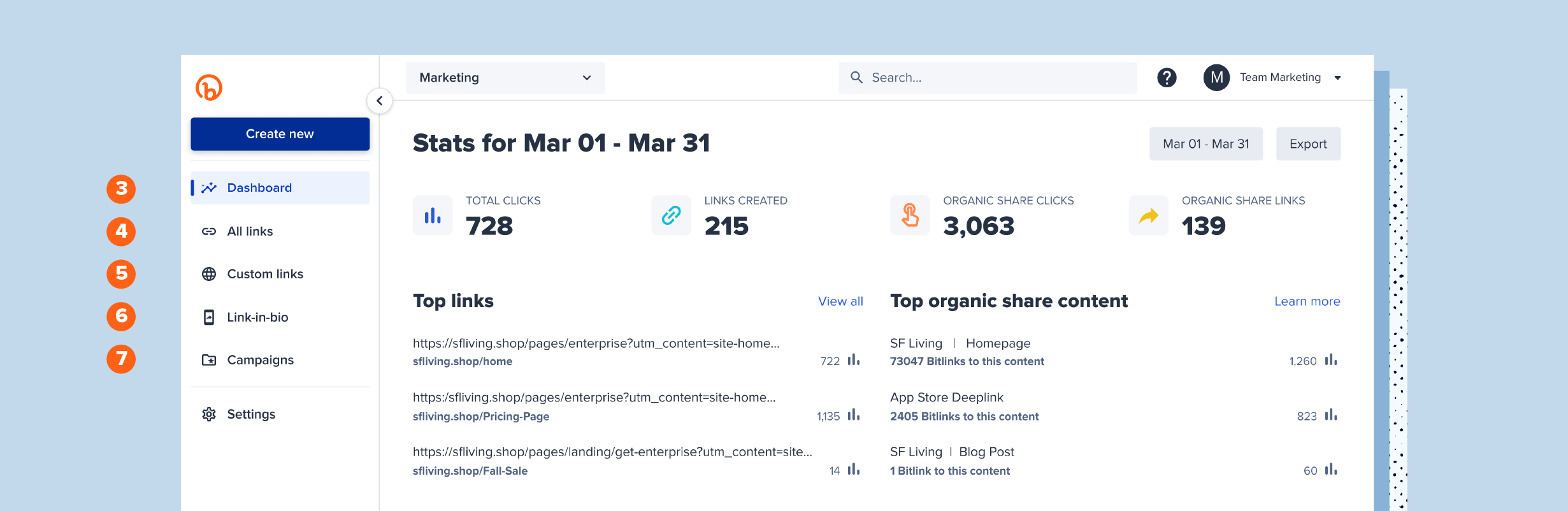
The second big change you’ll notice is the navigation icons on the left side. Now, your most frequent actions are streamlined and visible! Starting at the top:
- The Big Blue Plus Sign: Your shortcut to accessing the full link shortening and Link-in-bio creation flow. And, if you have a Premium or Enterprise account, it’s also your shortcut to creating new Campaigns.
- Dashboard: Your Connections Platform home page; here you’ll find all of the stats and advanced analytics for all of your links.
- All Links: Manage all of your existing links and QR Codes. Generate a QR Code with a single click from this page.
- Custom Links: Easily find and manage all of the links you created with both a custom domain and custom back-half. Custom domains are available with Basic, Premium, and Enterprise accounts.
- Link-in-bio: Create and edit your personalized Bitly Link-in-bio microsite.
- Campaigns: Premium and Enterprise subscribers can create and manage their campaigns.
- Settings: Access your profile preferences and account settings.
And Just for Our Enterprise Users
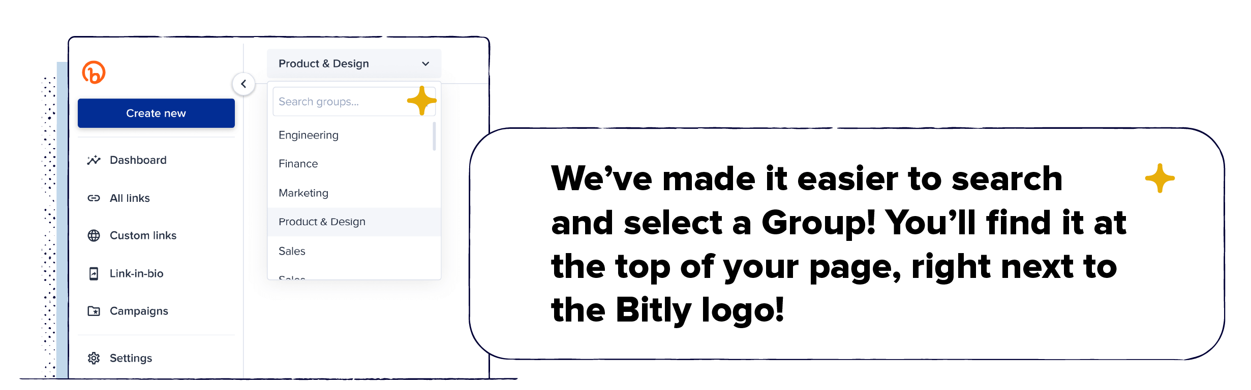
We’ve made it easier to search and select a Group! You’ll find it at the top of your page, right next to the Bitly logo!
A Peek Behind the Curtain
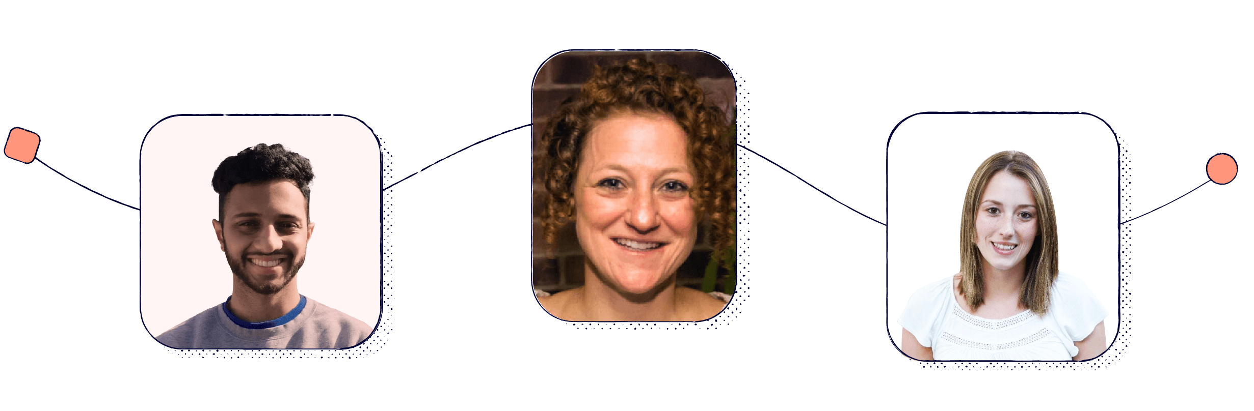
The new design is a result of feedback from customers like you! We take your feedback to heart and are constantly finding ways to make your Bitly experience the best one possible. Here’s just a small look at the team effort to take this from concept to launch. Three of our talented Bitizens who led this effort sat down with me to answer a few questions: Pawan Murthy, Product Manager, Jenny McKenzie, Director of Product Design and Makayla Clausen, Software Engineer. We hope you enjoy!
Helena: Can you give us an idea of how many people and how much time it took to bring this beautiful new design to our customers?
Pawan: It took a team of 8 people (Engineers, Design, and QA) over three months to bring this to life. We have some super-talented engineers and designers and it went much faster than expected. It did take some time before development to ideate and validate the designs but it was all part of the process.
Jenny: We had been seeing signals that the old navigation was confusing and didn’t showcase everything Bitly has to offer. In 2021, we did some early wireframe testing with positive results. Then, our Senior Product Designer, Danielle Gardner, took the designs and interactions to the next level, paid close attention to detail and iterated over the course of about 3 months.
Makayla: It was an important project with a lot of different variables. It took our team of eight about five months from the ideation phase until the release.
Helena: I know you LOVE connecting with our customers to hear what they love (and don’t) about the Bitly Connections Platform; is there any feedback or anecdote that you heard that particularly stood out and inspired you while taking this on?
Pawan: One of the more consistent feedback we got in surveys was that users couldn’t find what they were looking for in our application. It was hard for them to navigate to where they wanted to go. On top of this our global search was displayed in our settings page (very weird, we know). All of this, along with our vision for where we wanted to go with the product got us thinking towards a modern user interface that highlighted Bitly’s core products and made navigation and discovery much easier within our application.
Jenny: One time in a user interview, a research participant said something like, “I have never seen this navigation dropdown before, is it new?”, referring to the old navigation.
It surprised me that such a simple and necessary part of any web app was invisible to people. That experience increased our confidence that a more visible, easy to find and accessible navigation would work.
Makayla: The most consistent feedback I have heard about Bitly is that things were hard to find or that people didn’t know certain features existed. So, my inspiration came from my desire to remove barriers and empower our users to accomplish the tasks that are important to their workflow.
Helena: What was your favorite part of redesigning this experience?
Pawan: I would have to say working with our amazing team of engineers, designers, and marketing to make all this happen has been my favorite part of shipping this feature. Everyone was extremely eager to get this out, but we wanted to make sure we were shipping a quality product that solved our users problems. This improvement allows us to help our users discover the full potential of Bitly and to move towards our overall vision of helping our users make more meaningful connections.
Jenny: I love how addressing a core usability issue (the navigation) inspired a big shift in our visual design. Danielle and the engineers took Bitly’s look and feel to the next level and created the momentum we needed to continue making impactful improvements to the Bitly experience.
Makayla: Honestly, our navigation has been a feature I have wanted to work on since I started working at Bitly, so I was excited to deliver a new and improved navigation flow. My favorite part of the experience was definitely collaborating with my team and watching the designs come to life.
We hope you’ve enjoyed the tour of the new experience and getting to know some of our rockstar Bitzens! Head to your Profile in your Settings section and toggle on “Enable the new navigation” to start using the new experience today.


