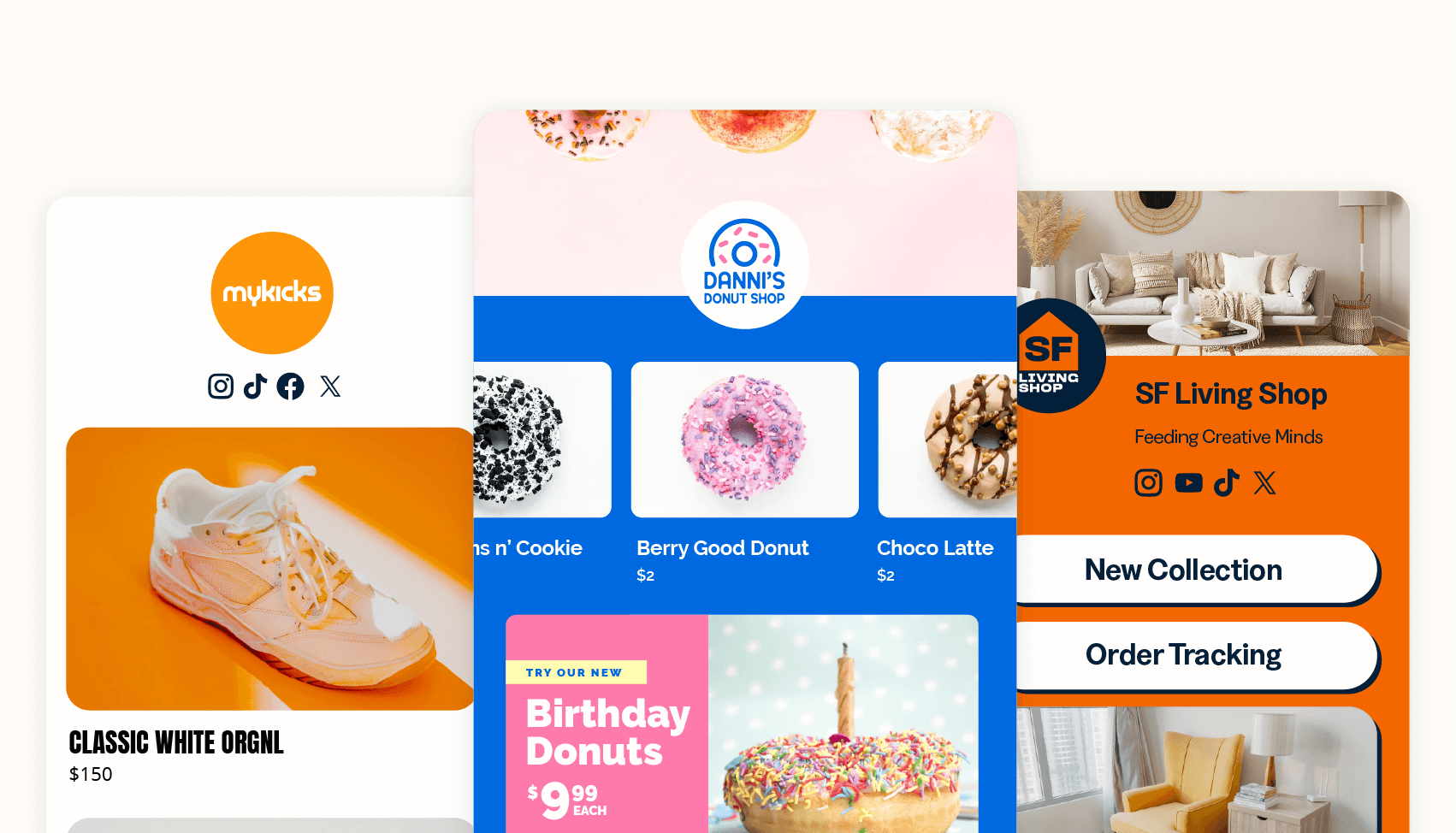
Are your landing page projects dragging on longer than they should? Want to launch your pages more quickly, cut costs, and manage everything without any technical skills?
With Bitly Pages, you can bypass all the cumbersome and time-consuming steps that slow you down. We provide you with easy-to-use, code-free templates and built-in analytics to monitor your page’s performance.
Too good to be true? In this blog, you’ll discover just how simple it can be to create impactful landing pages that turn engagement into conversions with Bitly Pages.
What are Bitly Pages?
Bitly Pages is a mobile-friendly landing page generator for businesses that want to showcase content, create audience engagement, and track performance in one central place. With Pages, you can house links, images, and YouTube videos—no coding required!
With fully customizable formats, you can create beautiful, branded web pages in minutes that perfectly align with the specific goals of your page. Bonus? Combine these with Bitly Links and Bitly Codes to create content destinations for all visitors who click and scan your links and QR Codes.
Tips for creating Bitly Pages that convert
Before you begin to create those compelling landing pages that attract the right audience, let’s explore 12 best practices for creating a highly convertible landing page.
1. Set clear goals and define your audience
Starting a project without a goal is like heading to an unknown destination without a map. Your goal is your compass—your North Star. With this in mind, try answering these questions so that you have a clear goal to work towards and a clear audience to target:
- What is the purpose of your landing page? Is it to promote an event or launch a new product?
- What is your overarching goal? Is it to generate leads, drive sales, or encourage sign-ups for an event or webinar?
- Who is this landing page for? Is it for small business owners in e-commerce? Marketing managers in the retail industry?
Defining your goal and audience will set the stage for every decision you make as you create your landing page.
2. Create a clear concept
A clear concept shines through the content you showcase on your landing page—from the headlines and body copy to the visual content and call to action. It helps visitors immediately understand what your page is about and what your offer can do for them, giving them unwavering clarity on why they should click on your call to action.
3. Write copy that converts
Get the copy star on your team to craft copy that delights and drives clicks. Content that converts is conversational and easy to read. This isn’t the time for complicated, wordy sentences—it’s time for snappy, informative, and clear sentences that speak directly to the audience. Your headings, body copy, and calls to action should persuade visitors in just a few words why they should click on your offering. Words have the power to do just that!
4. Optimize it for mobile
Let’s face it. We use our phones for all sorts of activities, from online shopping to leisurely reading. So, it makes sense that we meet our users where they spend most of their time—their smartphones. That’s why landing pages should be mobile-friendly, too. On top of that, a whopping 60.67% of website traffic comes from mobile devices—that’s more than half of all audiences!
The good news? Bitly Pages are automatically optimized for mobile devices—no extra work required. Creating effective landing pages has never been easier.
5. Use visual media
As audiences become more absorbed by images and videos from Netflix binges and Instagram scrolling, it’s clear why we’re drawn to visual stories. The data backs this up too; according to Forbes, incorporating multimedia like video can increase the time visitors spend on your page by at least 88%.
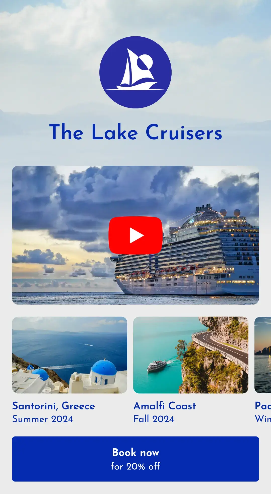
Take showcasing your new product on a landing page, for example. This is the perfect opportunity to present a demo video demonstrating how to use your product. Did you know that with Bitly Pages, you can easily add a relevant video to your landing page directly from YouTube? Providing visitors with a sneak peek of what you offer through an engaging video helps them visualize their own experience using the product.
This level of engagement encourages action, whether it’s subscribing to learn more or imagining the benefits they can gain. After all, in our visually-driven era, if a picture is worth a thousand words, then video truly reigns as king of content.
6. Add a call to action that drives clicks and scans
The CTA (call to action) should align with the goal of your landing page. Everything you’ve built is designed to funnel towards this key action—and the CTA is the centerpiece. If your goal is encouraging visitors to register for an event, the CTA should provide that extra incentive.
For example, “Sign up now and secure your early bird discount today!”, clearly shows the user what they should do (sign up), and why they should sign up (to get the discount). Including words like “now” and “today” also adds a sense of urgency, nudging the user to make a decision to click on the CTA.
As a golden rule, use succinct, action-oriented language to communicate your message quickly and clearly, giving your audience an irresistible reason to click that button or scan your code.
7. Save time with a landing page template
Creating landing pages from scratch is an ambitious endeavor that can be time-consuming, highly technical, and quite expensive.
Instead, take advantage of our ready-made landing page templates that you can customize in minutes—no technical skills needed—saving you time and money. Use our drag-and-drop features to create customized, brand-friendly pages that are easy on the eyes—and easy on your budget.
8. Share your landing page offline
Sharing your landing page isn’t limited to just the online world. In fact, you can bridge the online and offline worlds by pairing the Page you created in Bitly with a QR Code. This way, anyone who scans your QR Code offline can be taken directly to your landing page.
For example, if you have an event to promote and you create a Bitly Page, you can also generate a QR Code to print on a poster. When attendees scan it, they’ll immediately be directed to the landing page to purchase tickets to your event. Simple, right? Now your potential leads can easily find you through offline channels with just a quick scan on their phones.
9. Position the most important info above the fold
“Above the fold” might be a new term for some—it refers to the top part of a web page (or, in this case, a landing page) that’s visible without scrolling. This is where your landing page makes its first impression, which can make or break a visitor’s decision to stick around.
The content above the fold needs to grab attention quickly. It should tell visitors what they’ll get with a catchy headline, engaging text, and sharp visuals. If it doesn’t catch their eye right away, you risk losing them.
Considering that most people are flipping between a bunch of tabs or apps, this first impression is crucial and happens in a flash. In fact, 57% of the time people spend on a page is above the fold. So, getting all the important info about what you’re offering right at the top is vital to keep those bounce rates low.
10. Keep it clutter-free
When visitors land on your page, you want them to have a smooth experience. A minimalist approach can clear the path, guiding them on what to do next. It’s best to keep your copy short, sweet, and to the point, cutting out any fluff that might distract from your main offering.
A landing page packed with long paragraphs, too many images, and excess links—or worse, more than one offer—can leave users confused and overwhelmed. They might end up bouncing off your page.
Helping them focus on just one offer will keep them engaged and make it easier for them to grasp what you can do for them. Cut the clutter; any unnecessary information and visuals that don’t add value should go.
The last thing you want is a frustrated visitor who’s likely to look elsewhere. Your job is to make navigating your page as easy as possible, practically guiding them to click that CTA button.
11. Focus on the value proposition
Crafting a landing page from the perspective of your value proposition helps you clearly articulate what sets you apart from your competitors. Your market research should identify any gaps or pain points that your competitors haven’t addressed, positioning you as the go-to solution for your customers’ problems.
Defining your value proposition involves understanding your unique selling point (USP) that differentiates you from others. With this key information, you can confidently create a landing page that showcases how your offering benefits your customers in ways your competitors don’t.
By the time potential leads navigate through your landing page, they should have a clear understanding of what you can do for them.
12. Showcase social proof
Every brand understands the importance of building customer relationships. And since trust is a core foundation for any relationship, how can you build it from scratch? The answer is simple: customer reviews.
When considering your services for the first time, you shouldn’t expect prospective customers to trust you immediately. They have no reason to! That’s where customer testimonials come in, providing visual proof that your brand can be trusted, even if they’re unfamiliar with it.
To put things into perspective, Spiegel Research Center’s findings indicate that a staggering 92% of customers read online reviews before making a purchase. Featuring social proof on your landing page helps customers make informed decisions, giving them the confidence to trust the brand they’re considering subscribing to or purchasing from.
Social proof isn’t just for show—it demonstrates brand reliability and reassures customers that they will get what they need from your product or service. And it’s not just theoretical; the same study reveals that displaying customer reviews can boost conversion rates by up to 270%. That’s a significant statistic, proving that social proof is a powerful influencer.
An easy way to showcase reviews is through Bitly Short Links. Simply copy the link that houses your raving reviews, shorten it in Bitly, and keep track of who’s clicking on those review links.
Pro tip: You can also create a CTA that reads “Hear what our customer has to say about us” to encourage your visitors to click it. Ready to show off those glowing customer testimonials? Get your leads to take action, and watch as more customers jump on board!
3 ways Bitly helps you create impactful landing pages
We want you to ace your first impression so you can make a larger impact with Bitly Pages. That’s why we’ve included ready-to-go templates that can jumpstart the creation process right away, YouTube embeds that allow you to show off your best video content, a variety of image options that shine a light on your brand and offering—and to top it off, you get to track audience engagement on Bitly Pages all along the way!
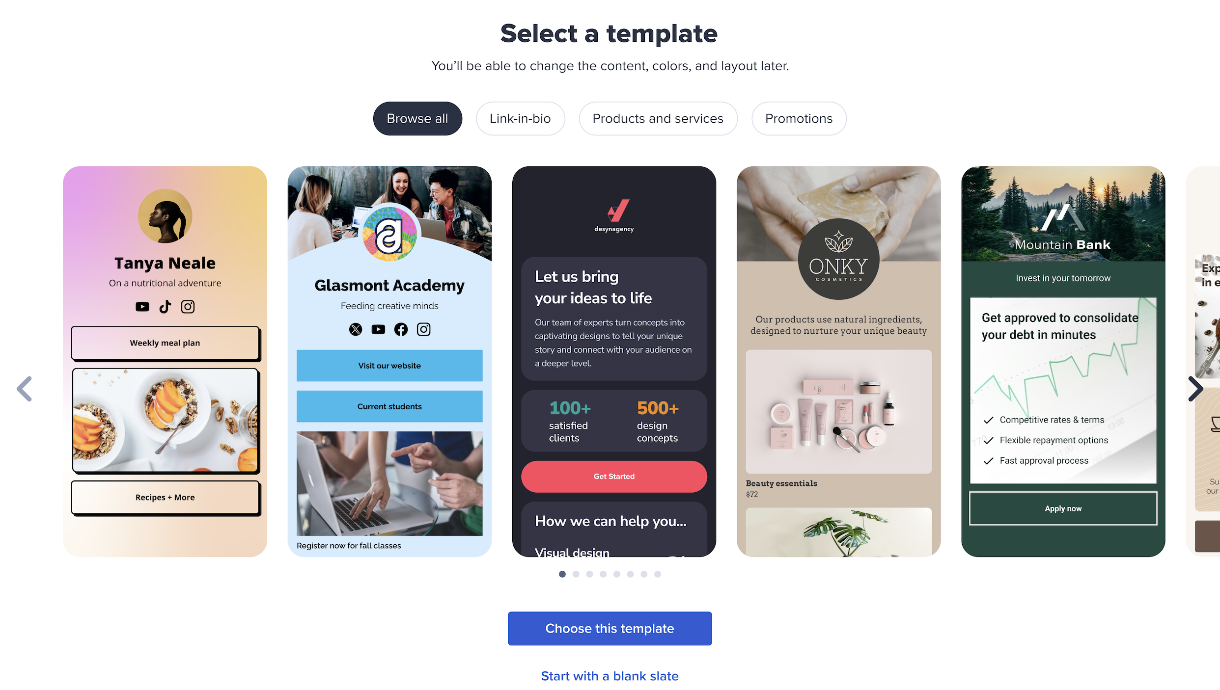
Template and layout options
With pre-made landing pages available in eight different layouts, you’ll have plenty of styling options at your fingertips to make your final page look polished, professional, and impeccable—almost as if you had a graphic designer guiding you every step of the way.
Using a ready-to-go template also empowers team members to tackle landing pages independently, cutting out the middleman. An added bonus? Your new page hits the market faster, using fewer resources and less time.
These ready-to-publish templates are fully customizable with plug-and-play features, allowing you to tailor your landing page with the fonts, colors, and formats that best represent your brand. Whether you aim to encourage newsletter sign-ups, promote your new product line, or boost social engagement with a Link-in-bio, these stunning templates are perfect allies in launching your landing page and capturing the hearts of new leads.
Eye-catching visual media
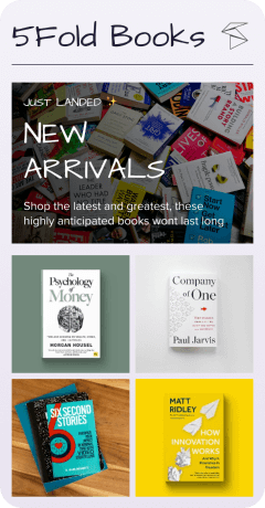
Adding visual media is a secret weapon to get your engagement soaring. From image grids and carousels to YouTube videos, adding stunning visuals on a landing page can turn up the dial, keeping your audience engaged longer.
Are you looking to attract new leads? Introducing a new product? Nurturing your current customer base? Using video content can be incredibly impactful for a variety of marketing goals. Lemonlight research reveals that 90% of marketers claim video helped them generate more leads. Even more telling, a staggering 94% of marketers have found that videos enhance user understanding of their products or services.
Hot tip: Use our YouTube embed feature to showcase an engaging video relevant to your landing page.
Images also aren’t to be underestimated. Eighty percent of users claim that they’re more likely to read content if it’s paired with striking imagery. Like two peas in a pod, copy and images work hand-in-hand to help users make sense of the content.
Are you looking to create more visual diversity or spotlight your brand, products, or services in a visual format? Bitly Pages lets you add up to nine images on an 3×3 image grid, which helps the user to learn about who you are and what you offer in a more captivating way. Or you can include an image carousel on your page that houses up to 10 images to showcase more visual content without crowding up the real estate on your mobile landing page.
Want to keep your audience’s attention longer than a fleeting moment? Add relevant videos and compelling imagery with ease using Bitly Pages and watch your conversion rate skyrocket!

Page performance data all in one place
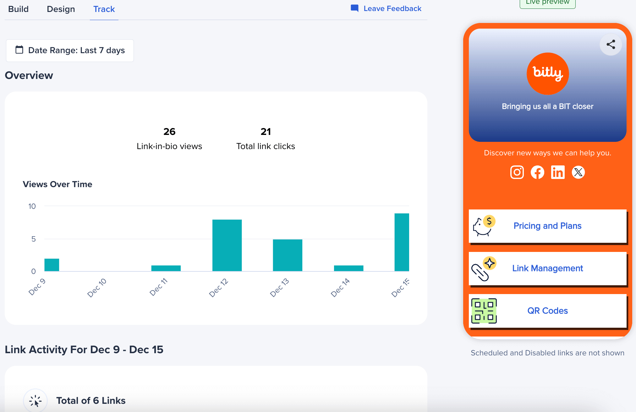
Once you’ve launched your landing page off the ground with Pages, it’s time to track end-to-end performance. Thanks to Bitly Analytics, you can create Pages and track performance in one central location, skipping the hassle of jumping between platforms.
Let’s dig into how the Connections Platform can help you track your performance:
- Total views of your Landing Page and aggregate link clicks: This audience data tells you how much engagement your landing page has attracted, from views to clicks. It provides a visual representation of the correlation between the page visitors and the amount of clicks. This data is invaluable for refining your current campaign or informing future ones.
- Views over time: Having a graphical representation of audience views over time offers a panoramic view of audience behavior across a specific period. It’s the perfect time to identify trends and notice how they ebb and flow over days, weeks, and months.
- Link activity for a selected period of time: Focusing on link activity within a specific time period can help you understand your audience’s click pattern. Clicks represent a conversion pathway. In other words, they signal a user’s interest in your content. After all, a user wouldn’t click unless they were interested.
- Views by referrer and device: Device data offers insights into the devices your audience used to browse your landing page—whether it’s desktops, mobile phones, or anything else. And then there’s referrer audience data—shedding light on how your audience discovers your content. Take Instagram, for example. If a lot of your traffic is coming from this channel, it could be an indicator of the platform’s influence in driving visitors to your landing page.
- Views by location: Knowing your top geographical locations from city to country level helps you learn where your visitors are coming from. This info allows you to tailor your marketing approach to better connect with the audiences in those areas.
The icing on the cake is when you create Bitly pages, you can share short links and QR Codes, giving you access to both click and scan data. With all this real-time data, gauging whether or not your landing page struck a chord with your audience has never been easier.
Turn visits into conversions with Bitly Pages
Gone are the days of needing code gurus to get your landing page up and running. Bitly makes it effortless to create dynamic landing pages in minutes, attract the right leads with visually striking carousels and image grids, amplify engagement with interactive video content, and so much more!
Attract, delight, and inspire your leads with impressive landing pages that are impossible to ignore—and best of all, track every click on the Connections Platform.
Sign up now and start creating impactful landing pages in Bitly today!

